About SF Arch Rival Font
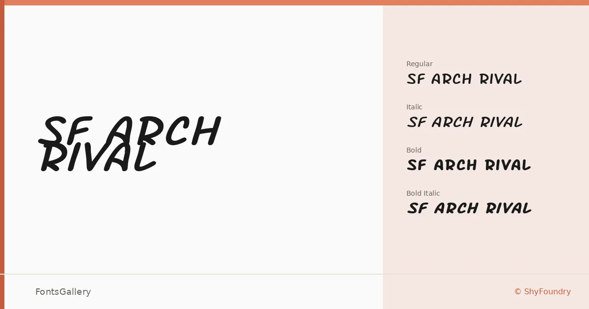
There is something deliberately worn about these letterforms — a grunge energy running through the extended proportions that reads less like decay and more like attitude. Derek Vogelpohl of ShyFoundry built this display family around wide, confident strokes that carry a vintage roughness without collapsing into illegibility.
Design Aesthetics & Character Characteristics
The family ships in four cuts — Regular, Regular Italic, Bold, and Bold Italic — all in the extended width, delivered as TTF files. That horizontal stretch gives headlines a commanding presence on the baseline, and the italic angles push the playful, poster-ready character even further. The weight range is tight but purposeful: the Bold is where the grunge texture really bites, while the Regular holds enough restraint to work at slightly smaller display sizes.
Recommended Usage & Font Pairing
This is a face built for branding work that needs edge — band merchandise, poster headlines, logo treatments, and T-shirt graphics where a raw, vintage mood is the point. Latin character coverage keeps it squarely in that territory. For pairing, it sits well against the clean geometry of Bahnschrift or Helvetica when you need contrast, and holds an interesting tension alongside the editorial softness of Canela or ABC Arizona; Etna offers a closer match in decorative spirit for layered headline compositions.
License & Usage Terms
SF Arch Rival is released under Personal Use terms — embedding is restricted, and commercial use is not permitted under this license, so confirm licensing with ShyFoundry at http://www.shyfoundry.com before taking it into a paid job.