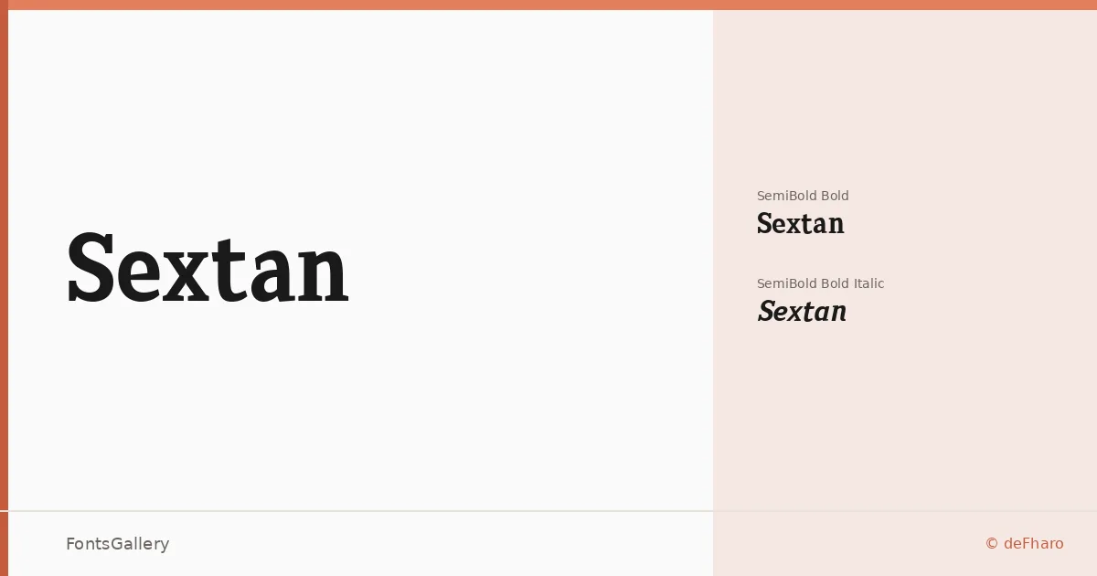
About Sextan Font
There is a deliberate weight to these slab serifs — bracketed, confident, built for the page rather than the screen. Fernando Haro of deFharo designed the family with editorial work squarely in mind, and the proportions reflect that: carefully calculated metrics and kerning that hold together at display sizes without sacrificing readability when text runs long. A complete set of lowercase alternates and advanced OpenType features give the family genuine flexibility at the typesetting level.
Design Aesthetics & Character Characteristics
The family sits in that productive zone between classic and modern — the slab construction gives it a professional, authoritative presence, while the forms stay clean enough to feel current. Available as SemiBold Bold and SemiBold Bold Italic in TTF format, the two cuts are unapologetically display-weight cuts, suited to moments that need a strong voice on the page. The italic carries the same structural density as the roman rather than softening into anything decorative.
Recommended Usage & Font Pairing
The weight and character of these cuts make them natural choices for headlines, book covers, magazine spreads, and branding work where a bold typographic gesture is called for — advertising layouts in particular benefit from the authority the slabs project. Coverage extends to Latin (partial), so verify character support against your specific copy. For text accompaniment, the family pairs well with Etna, Armelie, Kactigona, and the sans workhorses Helvetica and Bahnschrift.
License & Usage Terms
This family is available under Personal Use terms only (FFP); commercial use is not permitted under this license, and embedding is restricted — confirm before committing it to a commercial job by reviewing the commercial license at defharo.com.