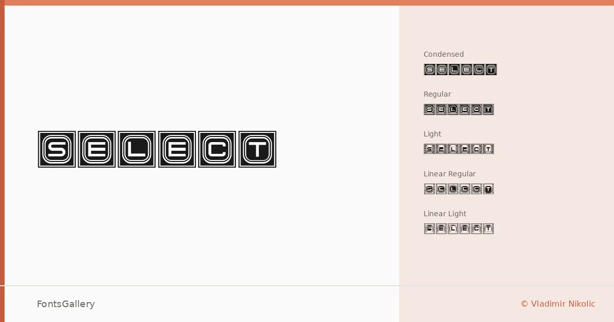
About Select Font
There is a deliberate tension running through this family — something between mechanical precision and raw edge — that makes it immediately recognizable on the page. It was drawn by Vladimir Nikolic, and the five cuts reflect a coherent design vision that treats weight and stroke structure as variables to push, not just adjust. The linear styles in particular expose the skeleton of the letterforms in a way that feels closer to technical drafting than conventional type design.
Design Aesthetics & Character Characteristics
This is a display family, and it commits to that role fully — futuristic in its geometry, with enough grunge in the details to keep it from feeling sterile. The available cuts span Select Condensed Regular, Select Light Regular, Select Linear Light Regular, Select Linear Regular, and Select Regular, giving you a range from spatially economical to structurally exposed rather than a traditional weight ladder. The condensed setting works hard in tight columns, while the linear variants strip the forms down to their outlines, opening up layering and contrast possibilities that a filled face simply cannot offer. All cuts ship as TTF files.
Recommended Usage & Font Pairing
The family is built for high-visibility applications — headlines, brand marks, posters, and logotype work where the letterforms need to carry a strong, modern charge. T-shirt and merchandise design is a natural fit given the bold, graphic quality of the condensed and linear cuts. When you need a quieter companion, it has been paired with Helvetica and Bahnschrift for neutral sans contrast, or with Canela, Etna, and AQUA when the job calls for a more distinctive or editorial counterpoint.
License & Usage Terms
Select is released under Personal Use terms, and commercial use is not permitted — confirm licensing with Vladimir Nikolic before committing it to any paid project. Embedding is limited to preview and print only.