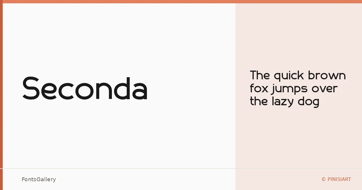
About Seconda Font
There is a quietness to this sans serif that earns attention without demanding it — clean strokes, restrained proportions, and just enough personality to keep it from feeling anonymous. It comes from PINISIART TEAM at the PINISIART foundry, and it arrives as a single Regular weight in both TTF and OTF formats.
Design Aesthetics & Character Characteristics
The design sits firmly in the modern, minimal end of the sans serif spectrum — professional without being corporate, elegant without any decorative flourish. Spacing feels considered, and the letterforms carry a geometry that reads with particular clarity at display sizes. With one weight in the family, the cut is built to do one thing well rather than stretch across a range.
Recommended Usage & Font Pairing
It is most at home in branding systems, logo lockups, magazine headers, presentation decks, and website headers — contexts where a confident, unhurried voice matters. Coverage extends to Latin scripts with partial support, so confirm your character requirements before committing to a project with extended Latin needs. For pairing, the contrast-rich serif of Canela makes a natural companion, as do the more expressive character of Armelie, the assertive weight of 321 Impact, the editorial refinement of ABC Arizona, and the textural energy of Kactigona.
License & Usage Terms
Seconda is offered under a Personal Use license, which means commercial use is not permitted — confirm licensing terms directly with PINISIART before applying it to any client or revenue-generating work. Embedding is set to installable.