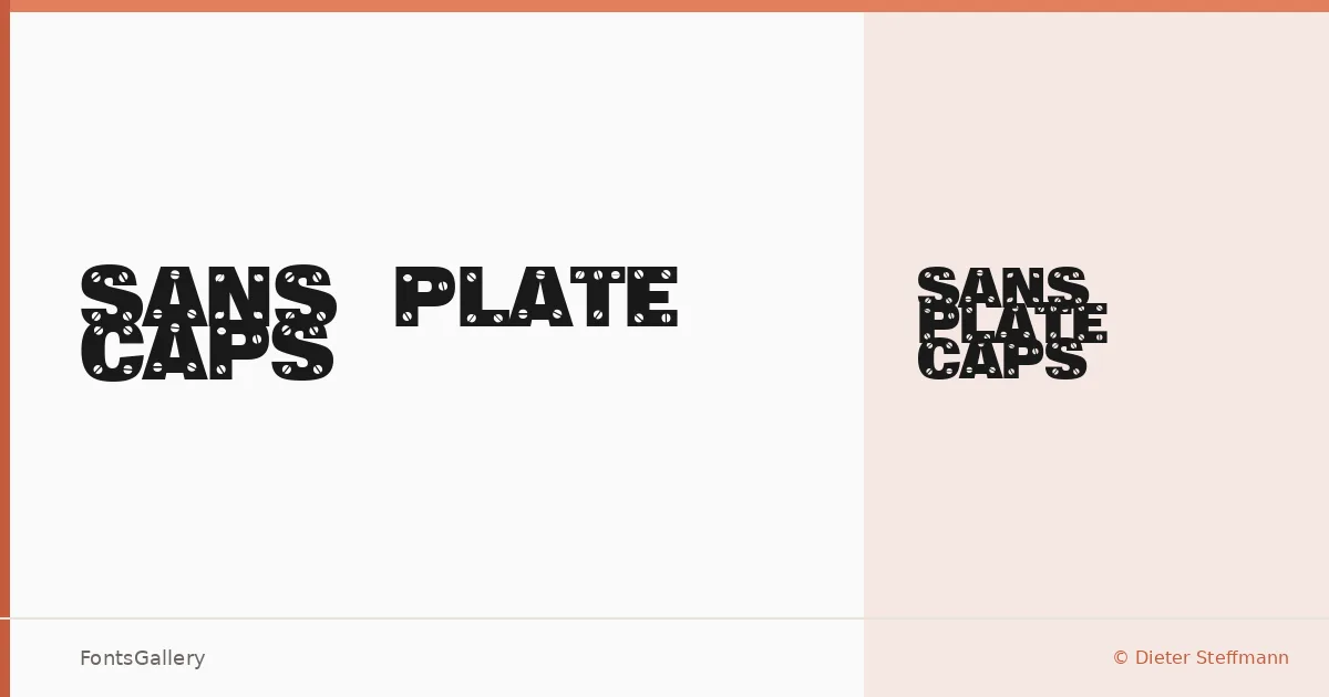
About Sans Plate Caps Font
There is a deliberate roughness to these capitals — the kind that reads less as a mistake and more as a mark of intention. Designed by Dieter Steffmann under Typographer Mediengestaltung, this display face works entirely in uppercase, drawing on a grunge and vintage sensibility that feels worn-in rather than distressed for its own sake.
Design Aesthetics & Character Characteristics
The family ships as a single Regular cut in TTF format, which keeps the proposition clear: this is a display face built for impact at large sizes, not running text. The letterforms carry a rustic, bold weight that sits somewhere between an old industrial stencil and a hand-inked broadside poster. Latin coverage keeps the character set focused, and the overall texture rewards contexts where a touch of grit is the whole point.
Recommended Usage & Font Pairing
It earns its place in headline work, branding, logo lockups, poster composition, and T-shirt design — anywhere a single word or short phrase needs to carry visual authority without polish. For contrast, the clean geometry of Helvetica or the rhythmic regularity of Asap makes a natural counterweight, while the editorial warmth of Canela, the structured character of Etna, or the expressiveness of AQUA can each push the pairing in a different direction depending on the project's tone.
License & Usage Terms
This family is available for commercial use, and the embedding permission is set to installable, meaning it can be embedded and permanently installed from the documents in which it is embedded.