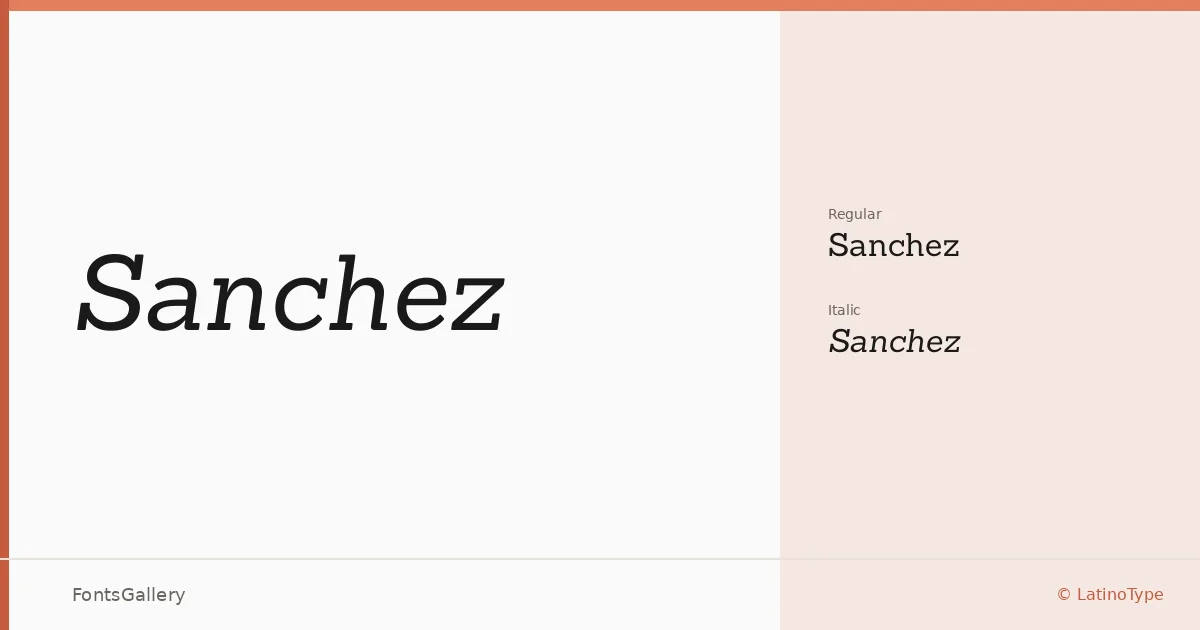
About Sanchez Font
There is a particular solidity to a well-drawn slab serif, and this one delivers it through letterforms that feel grounded without becoming heavy-handed. Designed by Daniel Hernández and published through LatinoType, the family carries a confidence in its proportions — squared terminals, sturdy serifs, and a structure that reads clearly at both display and text sizes across Latin-script languages.
Design Aesthetics & Character Characteristics
The family arrives in two cuts: an upright Regular and a companion Regular Italic, both provided as TTF files. The mood sits comfortably at the intersection of classic editorial tradition and contemporary professional polish — elegant enough for refined contexts, modern enough not to feel like a revival. The italic has a genuine angle and energy to it rather than simply slanting the roman, which makes the pairing feel considered rather than mechanical.
Recommended Usage & Font Pairing
The design is well suited to headline work, magazine layouts, book covers, and brand or logo applications where the type needs presence without shouting. For pairings, it holds its own alongside the clean neutrality of Helvetica or Bahnschrift, and it contrasts interestingly with the calligraphic warmth of Armelie or the character of Etna and Kactigona.
License & Usage Terms
Released under the SIL Open Font License, Version 1.1, commercial use is permitted, and the font may be embedded with installable permissions — full terms are available at http://scripts.sil.org/OFL.