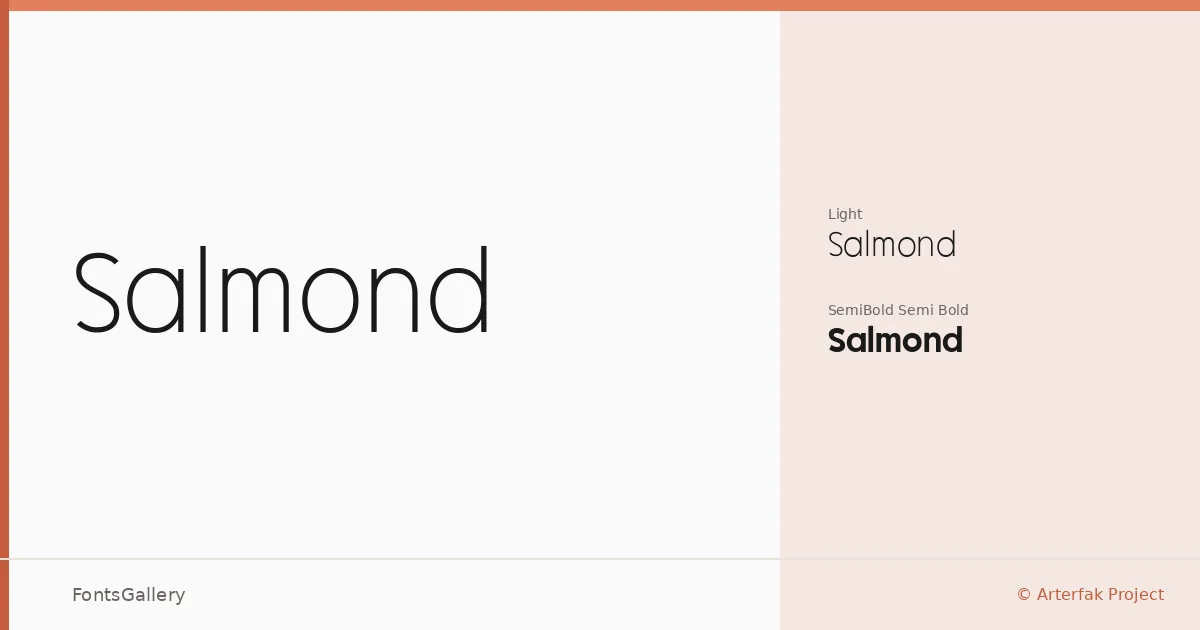
About Salmond Font
There is a deliberate restraint to this sans serif — the kind that comes from knowing exactly how much to remove. Ahmad Ramzi Fahruddin of Arterfak Project has built something spare and considered, with letterforms that hold their composure across both the Light and Semi Bold weights.
Design Aesthetics & Character Characteristics
The two-weight family — Light and Semi Bold — sits at the cleaner, more minimal end of the sans serif spectrum, carrying an elegant and professional tone without relying on ornamentation. The Light has an airy, editorial quality, while the Semi Bold brings just enough presence for hierarchy without tipping into heaviness. Both cuts are available in TTF and OTF formats. The overall character is modern and refined, the kind of weight pairing that lets spacing and proportion do the work.
Recommended Usage & Font Pairing
The weights read well in branding systems, on business cards, and in website headers where clarity and a polished impression matter. Magazine layouts benefit from the Light's quiet confidence, and logo work gains from the subtle authority of the Semi Bold. It pairs naturally with Canela and Armelie for editorial contrast, and sits alongside Kactigona, AQUA, or Minecraft when a project calls for a more characterful counterpart.
License & Usage Terms
Salmond is released under a Personal Use license — commercial use is not permitted, so confirm licensing terms with Arterfak Project before deploying it in any paid or client work. Embedding is limited to preview and print only.