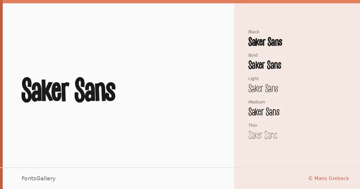
About Saker Sans Font
There is a quiet confidence in the way this sans serif holds itself — clean strokes, controlled geometry, and nothing wasted. It comes from designer Mans Greback and covers Latin with a TTF delivery across five weights: Thin, Light, Medium, Bold, and Black.
Design Aesthetics & Character Characteristics
The family sits in that modern, minimal register where branding studios and editorial teams feel most at home. Running from Thin through Black, the range gives you genuine contrast — a barely-there Thin for elegant spacing, a commanding Black for when the design needs to anchor a page or screen. The forms stay professional without turning cold, and the consistent stroke logic means the five weights behave as a genuine system rather than a collection of loosely related cuts.
Recommended Usage & Font Pairing
The weight range suits headline work, poster typography, logo lockups, and magazine display settings particularly well — anywhere that crisp, bold Latin type carries the visual load. It pairs with Canela and ABC Arizona if you want a serif counterpart to add warmth, or with Angeletta and Armelie for something with more personality in body or accent roles; Minecraft offers a contrasting geometric option for more expressive digital contexts.
License & Usage Terms
Saker Sans is distributed under Personal Use terms, so confirm your rights before any commercial job — visit www.mansgreback.com to obtain a commercial license. Embedding is permitted for preview and print only.