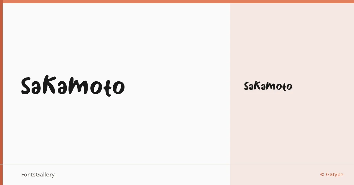
About Sakamoto Font
There is a looseness to this script that feels genuinely hand-drawn rather than mechanically constructed — the kind of mark a careful letterer leaves when they are relaxed enough to let the pen breathe. It comes from Gatype and is available in a single Regular weight, supplied in both TTF and OTF formats.
Design Aesthetics & Character Characteristics
Handwritten in category and playful in spirit, the face carries a rustic, whimsical warmth that sits comfortably between casual charm and deliberate craft. The single weight keeps things focused: every character leans into the same expressive energy, with the kind of organic variation in stroke width and baseline bounce that makes Latin text feel written rather than set. It is the sort of cut that rewards generous leading and room to breathe on the page.
Recommended Usage & Font Pairing
The mood reads well anywhere an informal human touch matters — children's book covers, greeting cards, poster headlines, branding marks that need personality, and social media graphics where a handcrafted feel cuts through. For contrast, it pairs naturally with the editorial weight of Canela or ABC Arizona, the clean geometry of Helvetica, or the character of Etna and AQUA alongside it.
License & Usage Terms
Sakamoto is released under a Personal Use license, which means commercial use is not permitted — confirm licensing terms with Gatype before applying it to any client or commercial work. Embedding is limited to preview and print only.