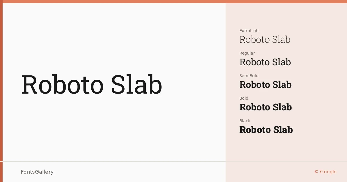
About Roboto Slab Font
The serifs here are geometric and upright — bracketed just enough to feel friendly, but drawn with the same rational structure that runs through the broader Roboto lineage. Christian Robertson designed it for Google, extending a systematic approach to type into slab territory without losing the mechanical precision that makes the design legible at every scale. It ships as TTF files with a variable font included alongside discrete cuts from Thin through Black.
Design Aesthetics & Character Characteristics
This is a modern slab serif that wears its classicism lightly: the stroke contrast is low, the forms are open, and the weight range — Thin, ExtraLight, Light, Regular, Medium, SemiBold, Bold, ExtraBold, and Black — gives it genuine range rather than the usual handful of cuts. The variable file lets you move across that range fluidly. Taken together the styles read as professional and self-assured, capable of the bold confidence a headline demands while staying controlled enough for sustained reading.
Recommended Usage & Font Pairing
Its best work is at display sizes: magazine spreads, poster hierarchies, website headers, and branding systems where you need a structured, authoritative anchor. Language coverage spans Latin, Vietnamese, Cyrillic, and Greek, which broadens the range of editorial and branding jobs it can handle without substitution. For pairing, the family sits naturally alongside Helvetica for a classic editorial contrast, or with Asap for a more contemporary workhorse combination; Armelie, Kactigona, and Etna each offer more expressive counterpoints when the brief calls for something less neutral.
License & Usage Terms
Released under the Apache License 2.0, which allows commercial use — embedding is set to installable, so you can distribute documents and applications with the font included without restriction.