About Rider Font
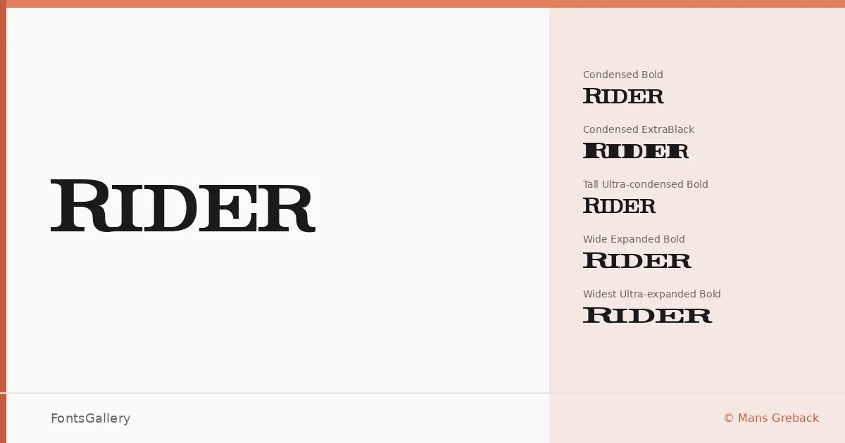
There is real ambition in the width system here — five distinct horizontal stretches, from Tall Ultra-condensed to Widest Ultra-expanded, each running through Light, Bold, and ExtraBlack weights with matching italics. That gives the family thirty cuts in total, all drawn by Swedish type designer Måns Grebäck. The slab serifs are sturdy and deliberate, carrying a vintage authority that reads as confident rather than nostalgic.
Design Aesthetics & Character Characteristics
This is a slab serif with a classic, professional backbone and enough weight range to shift from refined editorial to full-force poster work. The condensed and ultra-condensed variants pack serious tension into tight columns, while the expanded and ultra-expanded cuts breathe out into something almost ceremonial. At ExtraBlack, the strokes are heavy enough to command a page on their own; at Light, the family retains that same structured, vintage character without feeling thin. All styles are delivered as TTF files, and Latin alongside partial Greek coverage is included.
Recommended Usage & Font Pairing
The width spectrum makes this especially well suited to headline and poster work where you need to fill or constrain a measure precisely — magazine mastheads, branding lockups, and logo treatments all sit comfortably in its range. For pairing, the family works alongside Etna, Armelie, Helvetica, Kactigona, and Bahnschrift, any of which can provide the contrast a neutral companion needs against such structured slab forms.
License & Usage Terms
This family is offered under Personal Use terms only — commercial use is not permitted, and embedding is restricted to preview and print. Before any public or professional application, contact Måns Grebäck directly at http://www.mawns.com to arrange the appropriate licence.