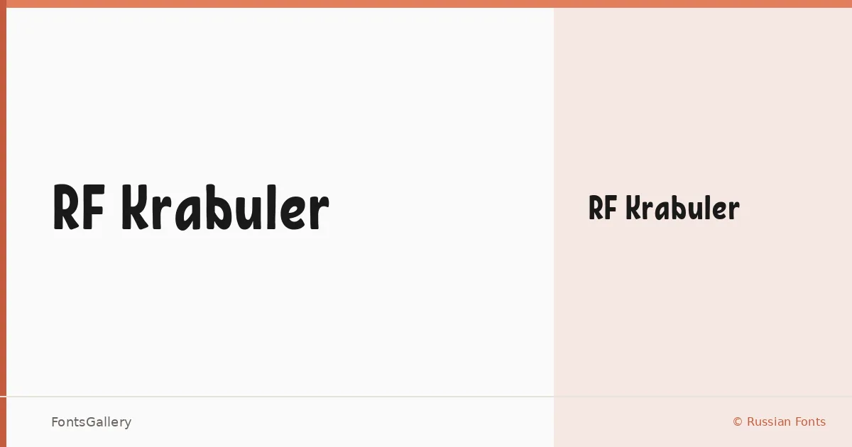
About RF Krabuler Font
There is something almost hand-inked about this display face — the strokes feel drawn rather than constructed, with a loose, expressive energy that recalls hand-lettered signage and mid-century print ephemera. It comes from designer Misha Panfilov under the Russian Fonts foundry, and it covers both Latin and Cyrillic scripts in a single Regular weight. The letterforms carry a deliberately rough charm, sitting somewhere between vintage woodblock typography and the kind of playful brushwork you find on old carnival posters.
Design Aesthetics & Character Characteristics
RF Krabuler is a display typeface with a bold, whimsical character — the sort of face that reads as confident and a little irreverent at once. There is only one style in the family, a Regular cut, delivered in TTF, EOT, WOFF, and WOFF2 formats. Its weight feels substantial on the page without becoming heavy, and the organic variation in stroke widths gives headlines a hand-crafted quality that strictly geometric display faces simply cannot replicate.
Recommended Usage & Font Pairing
This is a face built for situations where personality has to land immediately — poster headlines, branding lockups, logo treatments, T-shirt graphics, and children's book covers all suit its playful, vintage mood well. The dual Latin and Cyrillic coverage makes it genuinely useful for projects that need to speak across both script systems. For contrast pairings, the clean rationalism of Helvetica or Bahnschrift works well against its looseness, while Canela or Etna offer softer editorial counterpoints; AQUA shares enough display energy to work in layered compositions.
License & Usage Terms
RF Krabuler is offered under Personal Use terms, which means commercial use is not permitted — confirm licensing directly with Russian Fonts at russianfonts.ru before deploying it in any paid or commercial work. Embedding is permitted as editable.