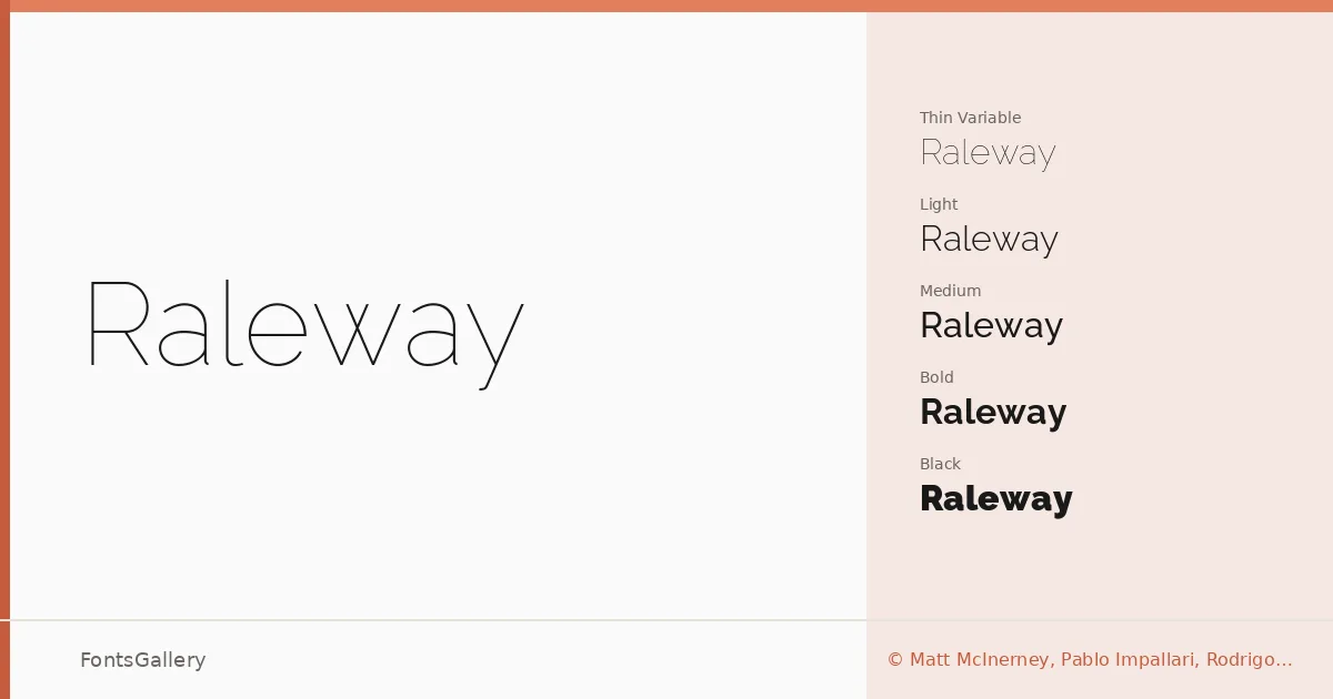
About Raleway Font
What strikes you first about this family is the Thin weight — a single elegant cut that Matt McInerney originally drew, later expanded into a full nine-weight range by Pablo Impallari and Rodrigo Fuenzalida, with kerning refined by Igino Marini. The default character set sits in neo-grotesque territory, but a stylistic alternate pulls the letterforms toward something more geometric, giving the family a productive tension between warmth and precision. Old-style and lining numerals, discretionary ligatures, and a thorough set of diacritics are all included in the download.
Design Aesthetics & Character Characteristics
The family spans Thin Variable through Black, each weight available in both upright and italic, plus variable font files for the full optical range in a single file. Across all of them, the mood is consistently minimal and modern without feeling cold — qualities that make the heavier cuts feel authoritative in headlines while the lighter ones retain a quiet elegance. Latin Extended (partial), Vietnamese, and Cyrillic coverage means the family can serve multilingual editorial and branding work without falling back to a substitute face for those scripts. The TTF files embed with installable permissions, so they travel cleanly into documents and presentations.
Recommended Usage & Font Pairing
The display origins show up most clearly in branding, logo work, website headers, and presentation decks, where the strong weight contrast across the range gives a designer real choices rather than two or three similar options. For pairing, the clean lines sit comfortably alongside Canela's editorial serif warmth or the expressive energy of Armelie and Kactigona; Urban Thunder Demo and AQUA push the combination toward more graphic, high-contrast territory.
License & Usage Terms
Raleway is released under the SIL Open Font License (OFL), Version 1.1, which permits free use in both personal and commercial projects; full terms and the accompanying FAQ are at http://scripts.sil.org/OFL.