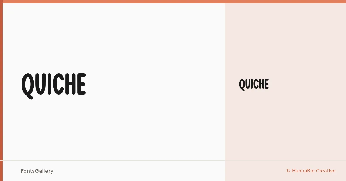
About Quiche Font
There is a self-assurance to this display face — the kind of weight and presence that announces itself at large sizes without shouting. Released by HannaBie Creative under designer Lady Hanna, it arrives as a single Regular cut, which tells you something about its intent: this is a face built for a specific register, not a workhorse meant to cover every size and context.
Design Aesthetics & Character Characteristics
Quiche sits firmly in the display category, drawing on a modern, professional sensibility with a boldness that holds up in headline and poster applications. The single Regular style is offered in both TTF and OTF formats, making it straightforward to deploy across standard design workflows. Its character is confident and considered — the kind of letterform that reads as deliberate rather than decorative, suited to contexts where a brand or publication wants clarity with a distinct point of view.
Recommended Usage & Font Pairing
This face earns its keep in branding work, magazine headers, logo lockups, and large-format poster design — anywhere a single strong display line needs to carry the moment. For body copy or secondary type, it pairs well with the neutrality of Helvetica or Bahnschrift, and sits comfortably alongside editorial faces like Canela or Etna; AQUA is also listed as a companion for projects that want to stay within a bolder, more graphic palette.
License & Usage Terms
This family is released under a Personal Use license, which means commercial use is not permitted — confirm licensing terms directly with HannaBie Creative Studio before applying it to any client or commercial job. Embedding is set to installable.