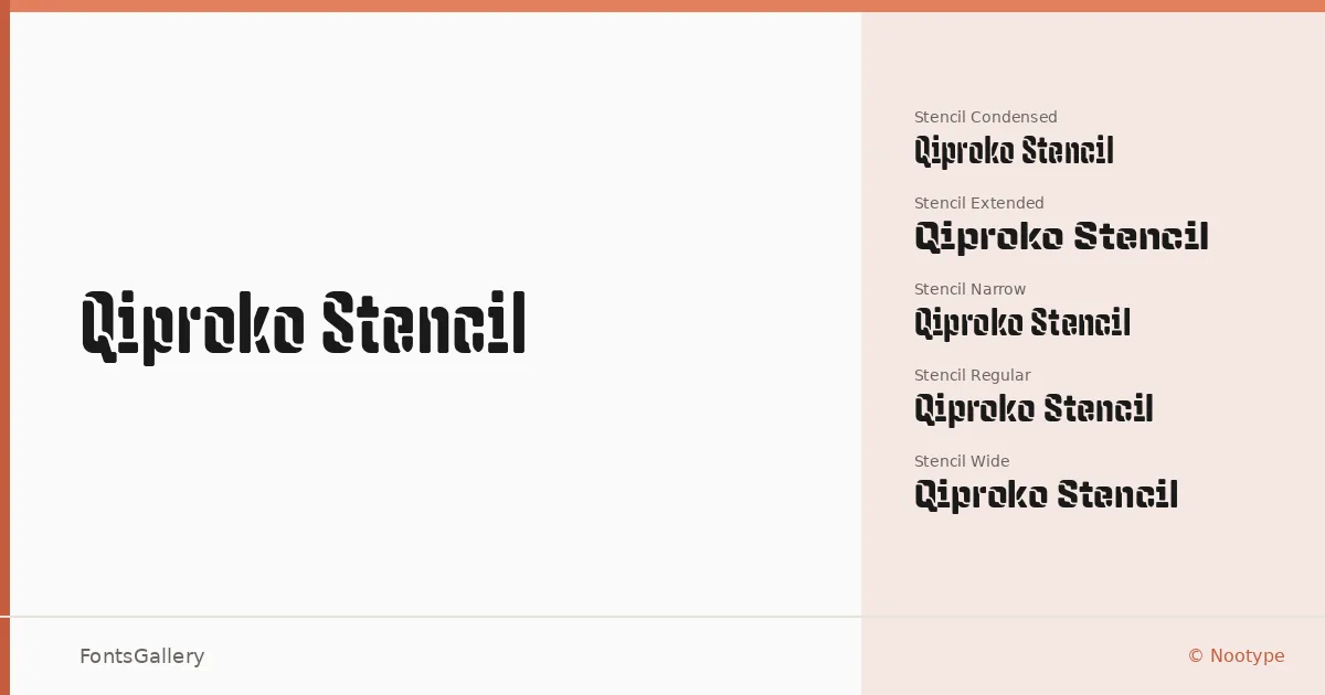
About Qiproko Stencil Font
There's a deliberate tension in these letterforms — the broken, stenciled cuts of blackletter architecture colliding with a disciplined modular structure. The family was designed by Nico Inosanto under the Nootype foundry, and the result sits somewhere between a historical guild typeface and something you'd find painted on an industrial crate. The stencil interruptions don't feel like damage; they feel intentional, like the design was always meant to be built that way.
Design Aesthetics & Character Characteristics
The family spans ten widths across two tracks: the base blackletter cuts in Condensed, Narrow, Regular, Extended, and Wide, and a matching stencil set in each of those same five proportions. Every style ships as OTF. The mood runs consistently bold and grunge-adjacent, with a vintage weight to the strokes that reads as classic craftsmanship rather than mere pastiche. Narrower cuts like Regular Stencil Condensed hold their own at large display sizes, while the wider stencil variants carry more visual mass and suit rougher, high-contrast applications.
Recommended Usage & Font Pairing
The width range makes it genuinely useful across branding, signage, poster headlines, and T-shirt design — anywhere a strong, characterful display face can anchor a composition. The stencil cuts add a raw, utilitarian edge well-suited to logo work that needs grit without losing legibility. Pair it against the clean neutrality of Helvetica or Asap for contrast, or alongside Canela, ABC Arizona, or Etna when a more editorial or refined counterweight is called for.
License & Usage Terms
This family is distributed under a Demo license, which covers personal use only — confirm licensing terms with Nootype directly before committing it to any commercial job. Embedding is permitted at the editable level.