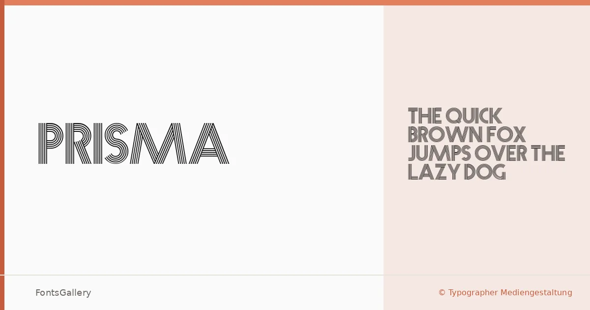
About Prisma Font
There is something immediately theatrical about these letterforms — capitals built from thin parallel lines that create an almost prismatic, luminous effect within each stroke. This is a revival of a display typeface originally designed by Rudolf Koch for the Gebr. Klingspor type foundry in 1932, now made available through Typographer Mediengestaltung. The construction is purely uppercase, as the "Versalschrift" designation suggests — every character is drawn as a capital, and the internal line structure gives the whole alphabet a quality that sits somewhere between Art Deco precision and early modernist experimentation.
Design Aesthetics & Character Characteristics
The family is a single cut — Regular — which means the design speaks entirely through its own structure rather than through weight contrast. Its mood is bold and classic, yet the geometric restraint of those interior lines reads as genuinely modern. The vintage origins are unmistakable, but the stripped-down letterforms translate surprisingly well into contemporary headline work. Available in both TTF and OTF formats, it covers the Latin script.
Recommended Usage & Font Pairing
The natural home for these letters is anywhere scale and impact matter: posters, logotypes, headline treatments, and branding that wants historical weight without looking merely nostalgic. T-shirt design is a genuine sweet spot — the linear structure holds beautifully at large sizes and reproduces cleanly in print. For body text or supporting type, the neutrality of Helvetica or Bahnschrift provides clean contrast, while Canela adds a contemporary editorial softness; Etna and AQUA offer bolder, more expressive companions depending on the direction of the project.
License & Usage Terms
This family is available for commercial use under terms described at the license URL — the foundry's note reads simply "have fun and enjoy." Embedding is permitted at the installable level.