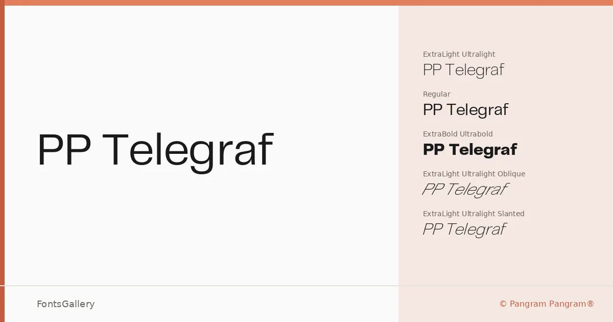
About PP Telegraf Font
There is a cool, almost telegraphic economy to these letterforms — clean terminals, restrained geometry, and just enough humanity in the spacing to keep things from feeling mechanical. Nick Losacco designed the family under the Pangram Pangram® banner, and the result sits comfortably in that territory where minimal and modern stop being contradictions. The Latin character set is precise without being cold.
Design Aesthetics & Character Characteristics
The family spans three weights — Ultralight, Regular, and Ultrabold — each available in upright, oblique, and slanted cuts, giving you nine OTF files in total. That spread from hair-thin to heavy-black is the family's main argument: the Ultralight carries an editorial fragility while the Ultrabold pushes into bold, confident display territory, and the oblique and slanted variants let you work with axis and energy rather than a static roman alone. The overall mood reads as professional and modern throughout.
Recommended Usage & Font Pairing
The weight range makes it a natural choice for branding, logo work, magazine layouts, and website headers where hierarchy needs to be established quickly and clearly. The Ultralight Oblique in particular has a quality well-suited to fashion and editorial headline use. From the listed pairing options, it works well alongside Canela for a sans-serif-meets-serif contrast, or with Armelie, 321 Impact, AQUA, and Kactigona when the project calls for something with more expressive range.
License & Usage Terms
PP Telegraf is available under Personal Use terms — commercial use is not permitted under this license, so confirm your rights before deploying it on a client job or commercial publication. Embedding is set to installable.