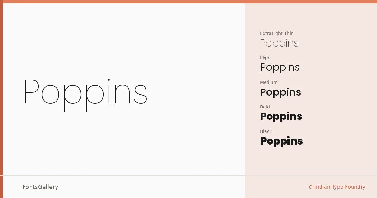
About Poppins Font
Every letterform in this geometric sans-serif is built on nearly perfect circles — you can feel it in the bowls of the 'o', the 'p', the 'b', the way the curves resolve with a quiet, even confidence. Ninad Kale handled the Devanagari and Jonny Pinhorn the Latin, both working under Indian Type Foundry. What makes the collaboration notable is how coherently the two scripts sit together: the Devanagari carries the same measured geometry as the Latin, so multilingual settings feel considered rather than cobbled.
Design Aesthetics & Character Characteristics
The family runs a full weight range — Thin and Thin Italic through Black and Black Italic, with ExtraLight, Light, Regular, Medium, SemiBold, Bold, and ExtraBold in between, each accompanied by a true italic. That breadth, combined with a minimal, modern character, gives designers room to build genuine typographic hierarchies within a single family. The forms are open and even-spaced, reading cleanly at both large display sizes and smaller interface text. Available as TTFs with installable embedding permissions, they drop into most workflows without friction.
Recommended Usage & Font Pairing
The professional, modern tone makes it well-suited to branding systems, magazine layouts, presentation decks, website headers, and social media graphics — anywhere a clean geometric voice needs to hold up across Latin and Devanagari content simultaneously. For contrast-driven pairings, the listed companions span a wide range of moods: the editorial serif Canela, the script warmth of Armelie, the aggressive weight of 321 Impact, the refined geometry of ABC Arizona, and the expressive personality of Kactigona each offer a different kind of counterpoint.
License & Usage Terms
Poppins is released under the SIL Open Font License, Version 1.1, which permits commercial use; full terms and an accompanying FAQ are available at https://scripts.sil.org/OFL.