About Playfair Display SC Font
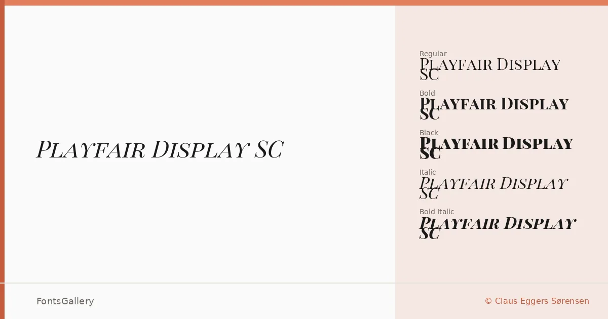
There is a particular tension in the high-contrast strokes here — hairlines that thin almost to nothing against terminals that land with real authority. This is the work of Claus Eggers Sørensen, and what separates this cut from the standard roman is its small caps construction throughout: every letter in the uppercase position is drawn as a true small capital, giving running display text a composed, architectural evenness that mixed-case settings rarely achieve.
Design Aesthetics & Character Characteristics
The family sits squarely in classic serif territory, carrying a luxury and vintage editorial quality that leans into old-style proportions without feeling stiff. The range spans Regular Italic, Regular, Bold, Bold Italic, Black, and Black Italic — all delivered as TTF files — so there is enough weight contrast to build genuine hierarchy within a single setting. The elegant mood sharpens as you move toward Black, where the thick strokes become almost theatrical without losing the underlying discipline of the letterforms.
Recommended Usage & Font Pairing
Book covers, magazine headlines, certificates, and branding work are where this family earns its keep — contexts that reward a certain deliberate formality. The Latin, Vietnamese, and Cyrillic coverage makes it a practical choice for multilingual publishing projects that still need to feel considered. For contrast in pairing, the clean geometry of Helvetica or Bahnschrift offsets the high-contrast serifs well, while Armelie, Etna, and Kactigona can bring complementary decorative or display energy depending on the job.
License & Usage Terms
Released under the SIL Open Font License (OFL), Version 1.1, with installable embedding permissions — commercial use is permitted, and the full license terms and FAQ are available at http://scripts.sil.org/OFL.