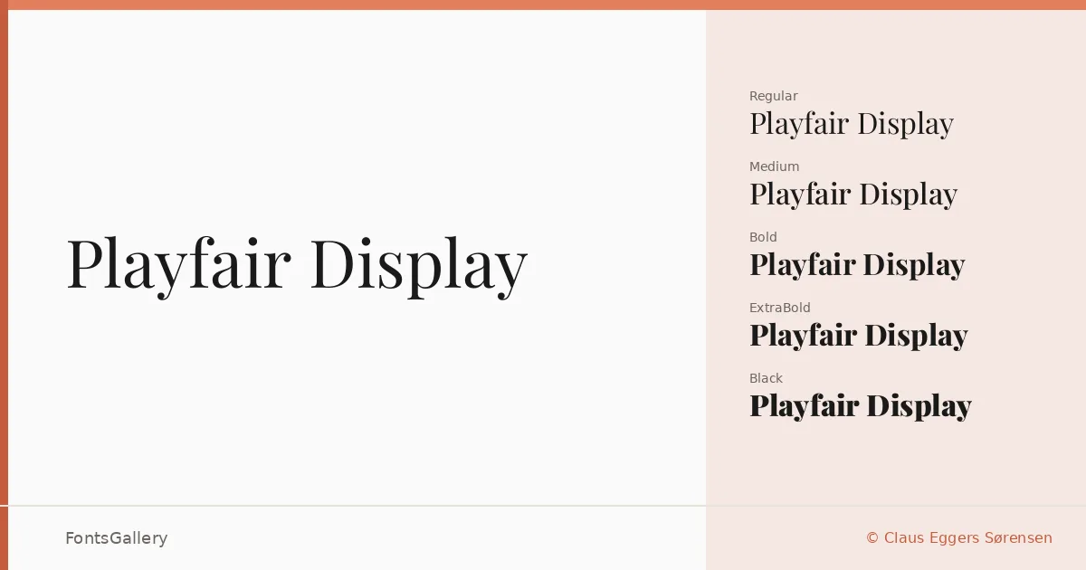
About Playfair Display Font
There is a particular tension in the contrast between thick strokes and hairline thins here — the kind of high-contrast serif energy that pulls the eye across a headline and holds it. Claus Eggers Sørensen drew this family with a classical editorial sensibility, the sort of letterforms that feel at home on a masthead or a book cover without ever feeling borrowed from a museum. The result carries genuine elegance without tipping into pastiche.
Design Aesthetics & Character Characteristics
The family spans Regular through Black, with Medium, SemiBold, ExtraBold, and corresponding italics filling out the range — fourteen cuts in all, including variable and variable italic files that give you continuous control across the weight axis. Every style reads with a luxury-leaning, vintage-inflected character that suits formal contexts as naturally as it suits contemporary branding. The italics are particularly worth setting at display sizes, where the swash-like details become visible and the classic mood intensifies. TTF files are provided throughout.
Recommended Usage & Font Pairing
The obvious applications — magazine headlines, book covers, certificates, and brand identities — are obvious for good reason: the high contrast and refined proportions were essentially built for them. Language support extends across Latin, Vietnamese, and Cyrillic scripts, which makes it a practical choice for multilingual editorial and branding work. For text accompaniment, the family pairs well with Helvetica or Bahnschrift for a clean sans contrast, or with Armelie, Etna, and Kactigona when a more decorative complement is needed.
License & Usage Terms
Released under the SIL Open Font License, Version 1.1, which permits commercial use freely; embedding is set to installable, so you can distribute documents with the fonts embedded without restriction. Full license details are at http://scripts.sil.org/OFL.