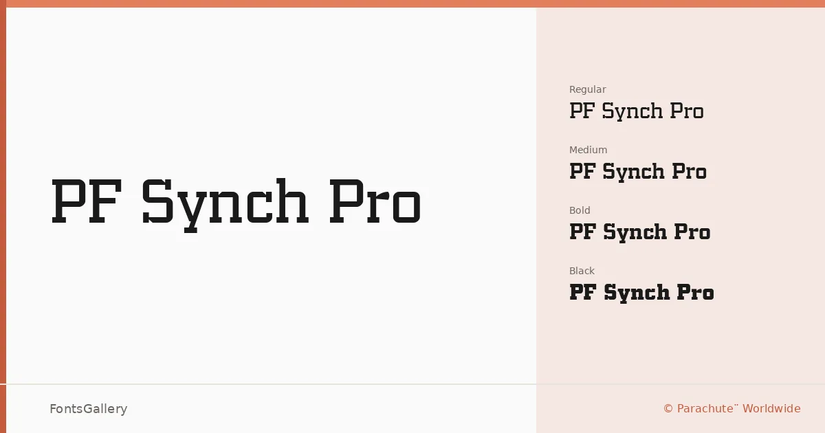
About PF Synch Pro Font
There is something deliberately architectural about this slab serif — the serifs land with authority, the strokes carry a measured tension between classical structure and contemporary sharpness. It was designed by Panos Vassiliou and released by Parachute¨ Worldwide, a foundry with a long investment in typefaces built to work across complex multilingual requirements. The result is a family that earns its weight through geometry rather than decoration.
Design Aesthetics & Character Characteristics
The family runs from Regular through Medium, Bold, and Black — a focused range that concentrates on headline-scale performance rather than sprawling text utility. Every cut feels confident without tipping into aggression: the slab construction gives warmth where a pure geometric sans would feel cold, while the overall proportions keep things modern and professional. Delivered in TTF format, the files cover Latin, Cyrillic, and Greek, making the weight range genuinely useful across multiple scripts within a single project.
Recommended Usage & Font Pairing
This is a family built for impact work — magazine covers, poster campaigns, brand identities, and logo lockups where the type needs to hold its own at scale. The Greek and Cyrillic coverage makes it a considered choice for editorial and branding work that reaches across European markets. For text and body layers, it pairs well with Helvetica or Bahnschrift on the neutral sans side, and with Etna, Kactigona, or Armelie when you want to stay closer to an expressive, designed feeling throughout.
License & Usage Terms
This family is available under Personal Use terms — commercial use is not permitted, so confirm licensing directly with Parachute¨ at their licensing page before taking it into a client or commercial job. The embedding permission is listed as installable.