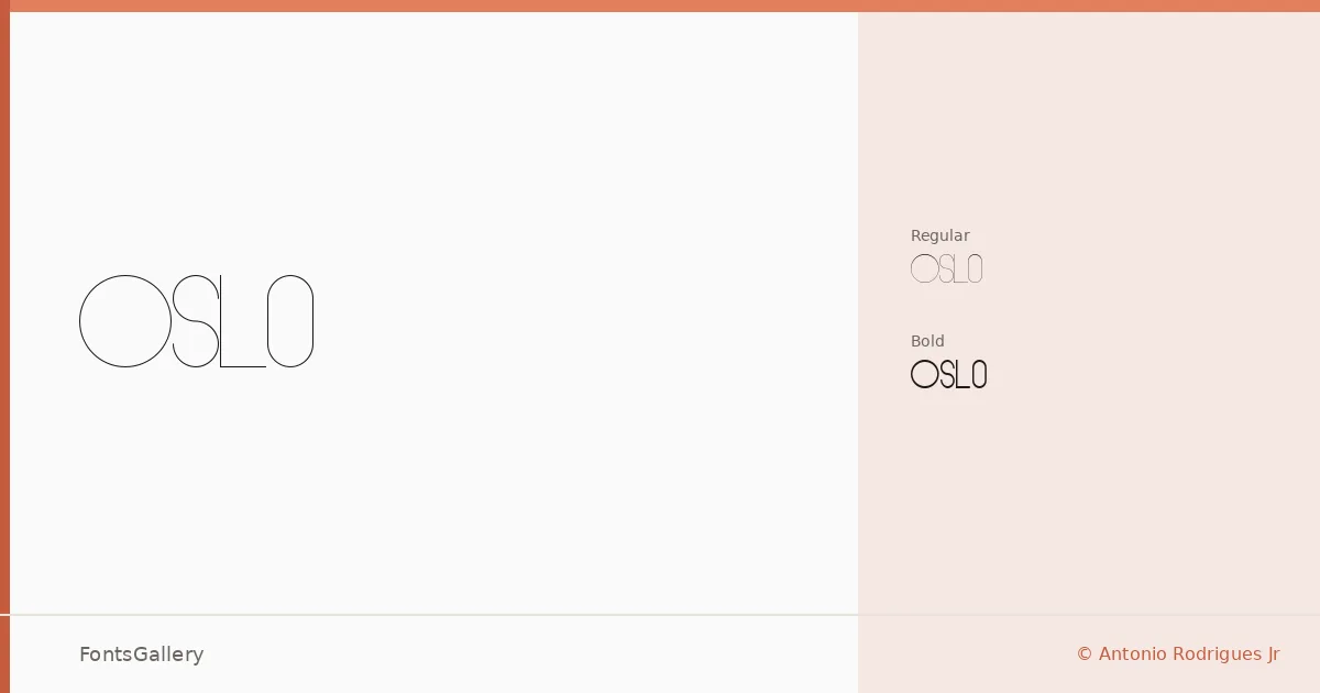
About Oslo Font
There is a deliberate stillness to these letterforms — a clean, unhurried elegance that rewards a second look. Oslo was designed by Antonio Rodrigues Jr, and it arrives in two cuts: Regular and Bold, both delivered as TTF files. The forms sit squarely in display territory, built with the kind of minimal geometry that holds its composure at large sizes.
Design Aesthetics & Character Characteristics
The mood is modern and restrained — elegant without ornamentation, minimal without feeling stripped. Regular carries the grace, Bold brings the authority, and the contrast between the two is exactly what you need when building a typographic hierarchy from scratch. Latin character coverage keeps things focused rather than sprawling, and the shapes have a crispness that reads as confident in any display context.
Recommended Usage & Font Pairing
This family earns its place in branding, logo work, poster headlines, magazine layouts, and website headers — anywhere the type needs to carry weight on its own terms. For body copy or supporting text, it pairs well with Canela or Helvetica when you want tonal contrast, and Etna, AQUA, or Bahnschrift when the project calls for something more structured alongside it.
License & Usage Terms
The family is available for commercial use, though the license is structured as free for personal use — for any commercial project, contact Antonio Rodrigues Jr directly at [email protected] to arrange the appropriate licence. Embedding is permitted for preview and print only.