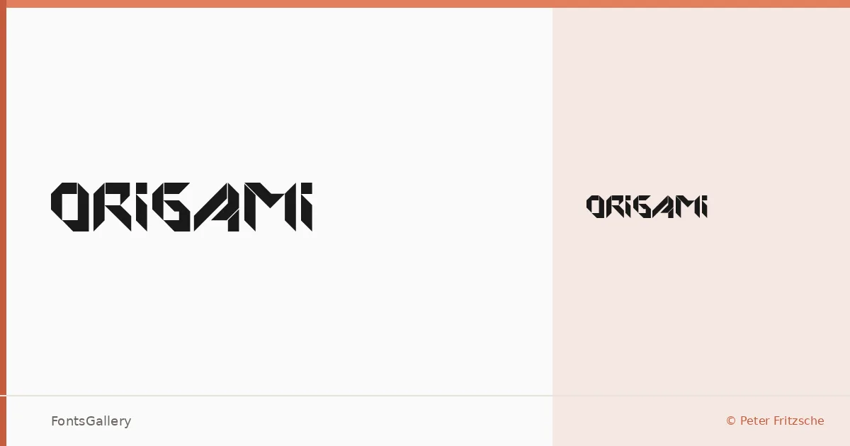
About Origami Font
There is something deliberate in the construction here — letterforms that feel folded rather than drawn, as if each stroke arrived at its angle through a series of considered creases. This single-weight typeface was designed by Peter Fritzsche under his formfound.com imprint, and it carries the quiet precision you would expect from someone thinking about structure as much as style.
Design Aesthetics & Character Characteristics
The family ships as one cut — Regular — in TTF format, so what you are working with is a focused, singular voice rather than a system built for range. The geometry of the letters has a hand-made architectural quality: rigid where most display faces are fluid, restrained where others reach for ornament. Latin coverage is partial, so it is worth checking your character requirements against the actual glyph set before committing to a layout.
Recommended Usage & Font Pairing
The structural character of these letterforms suits display settings — titles, editorial headers, short runs of text where the folded rhythm can be read and appreciated rather than endured across long passages. When you need something to sit alongside it, the listed companions span a useful range: the clean neutrality of Helvetica, the editorial warmth of Canela, the delicacy of Armelie, the solidity of Etna, and the clarity of AQUA all offer different contrasts worth exploring.
License & Usage Terms
This typeface is released under Personal Use terms — the copyright notice from Peter Fritzsche explicitly restricts it to private, non-commercial use, so confirm clearance before placing it in any commercial project. Embedding is limited to preview and print only.