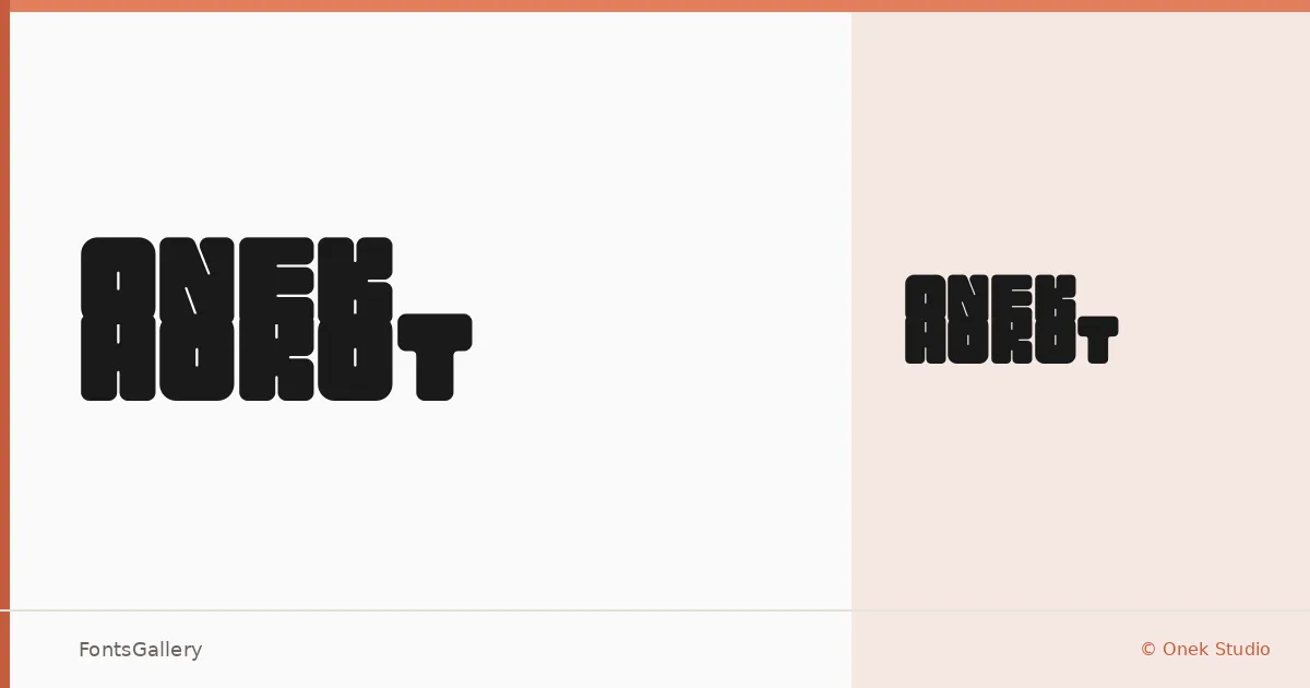
About Onek Hokot Font
There is something deliberately rough about this display face — a grunge-inflected tension that feels like it was designed to hold its ground at large sizes. Anshuman Gogoi, working under Onek Studio, has built a single-weight family with a futuristic edge that never fully lets go of its raw, hand-crafted undertow.
Design Aesthetics & Character Characteristics
The family ships as a single Regular cut in OTF format, which puts the full burden of expression on that one style — and it carries it. The forms are bold and modern in their proportions, with the kind of graphic confidence that suits display work rather than running text. Its grunge character keeps it from feeling sterile, while the futuristic structure stops it from reading as merely distressed. Latin coverage is partial, so check the character set against your copy before committing.
Recommended Usage & Font Pairing
This is a face built for high-impact, short-text contexts: posters, logos, branding systems, social media visuals, and T-shirt graphics where a single strong word or phrase needs to land hard. For contrast in layouts, the listed companion faces span a wide range — the soft editorial curves of Canela, the mechanical neutrality of Helvetica or Bahnschrift, and the distinct display personalities of Etna and AQUA all offer different ways to balance its weight.
License & Usage Terms
This family is released under Personal Use terms, which means commercial use is not permitted — confirm licensing directly with Onek Studio before applying it to any client or revenue-generating work.