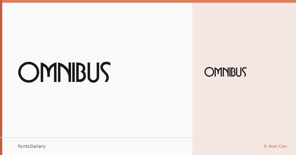
About Omnibus Font
There is something unhurried and deliberate about this face — the kind of confidence you see in lettering from an era when display type was drawn by hand rather than assembled by algorithm. Alan Carr released it as freeware under the Busorama Regular cut, a single style that nonetheless carries real presence on the page.
Design Aesthetics & Character Characteristics
This is a display face that lands somewhere between bold classicism and vintage elegance — the sort of letterforms that feel at home on a prohibition-era label or a luxury magazine cover from several decades back. The single Regular weight in TTF format means you are working with one considered cut rather than a sprawling system, which focuses the mind. Its character is unhurried and architectural, the kind of headline type that reads as authoritative without shouting.
Recommended Usage & Font Pairing
It earns its keep in branding, logo work, editorial headlines, and poster design — anywhere a strong, characterful display face sets the tone for everything beneath it. For body copy or secondary text, the listed pairings span a useful range: Canela and ABC Arizona bring editorial warmth, Helvetica and Bahnschrift offer clean neutrality, and Etna adds its own historical texture when a more layered aesthetic is the goal.
License & Usage Terms
Omnibus is distributed under Personal Use terms, which means commercial use is not permitted — confirm licensing arrangements before deploying it in client work or commercial projects. Embedding is set to installable.