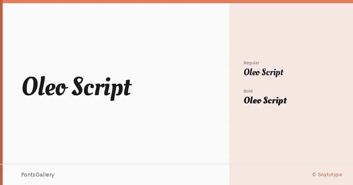
About Oleo Script Font
There is a particular confidence in the way these letters connect — a thick-thin contrast that feels drawn rather than constructed, with the kind of swing you associate with mid-century signage and editorial lettering. Oleo Script comes from Soytutype, the Argentine type studio behind a number of expressive display faces. The two weights in this family, Regular and Bold, share the same fluid, pen-influenced skeleton but differ meaningfully in color on the page, giving you genuine range within a compact offering.
Design Aesthetics & Character Characteristics
This is a display script that reads as classic and elegant without tipping into stiffness — the letterforms carry a vintage warmth that suits both formal and casual contexts. The strokes are generous, the joins confident, and the overall rhythm is upbeat without becoming playful. Both cuts ship as TTF files, and the embedding permission is set to installable, so the files travel well across workflows. Latin coverage handles the range of languages that script requires.
Recommended Usage & Font Pairing
The weight and presence of these letters make them a natural fit for branding, packaging, posters, and logo work — anywhere a headline needs to hold its own at large sizes or pull focus on a social media graphic. For body copy or secondary text alongside it, the clean geometry of Bahnschrift offers a strong contemporary contrast, while Canela brings an editorial softness that flatters the script's curves. If the brief calls for something more traditional, Times New Roman or Adobe Caslon Pro will anchor the script in a classically grounded typographic system, and Etna provides a sturdy middle ground for packaging hierarchies.
License & Usage Terms
Released under the SIL Open Font License (OFL), Version 1.1, which allows commercial use — full details and the accompanying FAQ are available at http://scripts.sil.org/OFL.