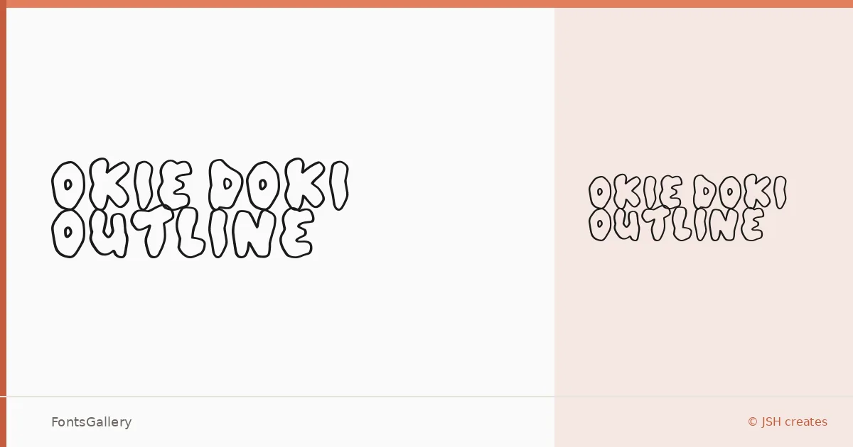
About Okie Doki outline Font
There is something inherently cheerful about a well-drawn outline display face, and Jonathan S. Harris of JSH Creates has leaned into that energy fully here. The letterforms carry a bold, rounded confidence — the kind of weight that reads instantly from a distance — while the open outline treatment keeps things light and whimsical rather than heavy-handed.
Design Aesthetics & Character Characteristics
This is a single-cut display family — one Regular style available in both TTF and OTF formats — built entirely around personality. The mood sits squarely in bold and playful territory, with outlines that give the characters a graphic, almost hand-crafted quality. It draws attention without shouting, which is harder to achieve than it looks.
Recommended Usage & Font Pairing
The face earns its keep on posters, T-shirt designs, logos, and anywhere children's book lettering needs warmth and immediacy. Branding work that wants approachability over authority will find a natural fit here. For pairing, the clean geometry of Helvetica or Bahnschrift balances the playfulness well, while more editorial companions like Canela or ABC Arizona add contrast in longer text; Etna offers another direction if the project calls for a stronger display-on-display pairing.
License & Usage Terms
Okie Doki outline is available under Personal Use terms, which means commercial use is not covered — confirm the terms at jshcreates.com and review the license agreement included with your download before committing it to any paid work.