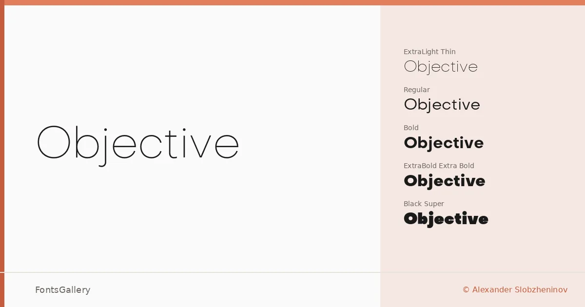
About Objective Font
There is a quiet confidence to this sans serif — the kind that comes from geometry applied with restraint rather than dogma. Designed by Alexander Slobzheninov, it covers Latin and arrives in OTF format across a genuinely expansive range of weights and their italics.
Design Aesthetics & Character Characteristics
The family runs from Thin and Thin Italic all the way through Light, Regular, Medium, Bold, ExtraBold, and Black, with two additional Super cuts that push the optical weight into display territory — sixteen styles in total. The overall feeling is minimal and modern without being cold: strokes are clean, proportions are measured, and the italics carry just enough personality to distinguish themselves from their upright counterparts without breaking the family's professional composure. At heavy weights the forms read as boldly graphic; at the lighter end they become quietly editorial.
Recommended Usage & Font Pairing
The weight range makes it well suited to branding systems, magazine layouts, website headers, and presentation decks — anywhere that a hierarchy needs to be built from a single coherent voice. For contrast-driven pairings, the editorial warmth of Canela or the serif authority of Times New Roman sit naturally alongside it, while Angeletta and Armelie introduce a calligraphic counterpoint for more expressive work; Minecraft offers something more unexpected for projects with a digital or gaming edge.
License & Usage Terms
The family is available for commercial use under its stated license. Note that embedding is permitted for preview and print only, so confirm those terms before deploying in interactive or app-based environments.