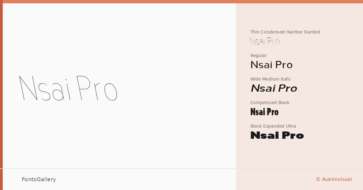
About Nsai Pro Font
There is a particular discipline to the way this family holds itself across weights — a controlled tension between geometric clarity and expressive width that reveals Audry Kitoko Makelele's commitment to typographic precision. Designed by Makelele under the Aukimvisuel foundry, the family spans eighteen styles ranging from hairline condensed slants to an expanded ultra black, each cut with a consistency that suggests long hours spent reconciling optical rhythm with systematic structure. The glyph set runs to 3,750 characters, and fifty-four refined ligatures give the text a notable fluidity that you rarely find across a family this architecturally ambitious.
Design Aesthetics & Character Characteristics
This is a sans serif built for people who think in grids but design with instinct. The mood is minimal and professional without being cold — the slanted and italic cuts in particular carry a quiet elegance that keeps the family from feeling purely mechanical. Eighteen styles are available as TTF files, organized across six widths (Compressed through Expanded) and a full weight range from Hairline to Ultra, taking in cuts such as Nsai Pro Cond Hair Slant, Nsai Pro Wide Light, Nsai Pro Exp SemBd Slant, and Nsai Pro Compressed Black, among others. Fifty-nine OpenType features — including small caps, stylistic variants, intelligent numerals, and regional localization — are built into the architecture, giving the family genuine depth rather than surface-level coverage. Latin script is supported throughout.
Recommended Usage & Font Pairing
The family is built for high-stakes typographic contexts: poster campaigns, magazine headlines, brand identities, and logo work where weight contrast and width variation need to do real compositional work. The compressed cuts hold authority in tight column settings; the expanded ultra reaches naturally toward display and signage at scale. For pairing, the listed companions — Canela, Armelie, Urban Thunder Demo, AQUA, and Kactigona — each offer a tonal contrast, whether through a softer serif character or a more expressive display energy, that can anchor or counterpoint the family's precision-driven neutrality.
License & Usage Terms
This family is released under a Personal Use license, which means commercial use is not permitted — confirm terms directly with Aukimvisuel before deploying it in any client or revenue-generating work. Embedding is restricted to preview and print only.