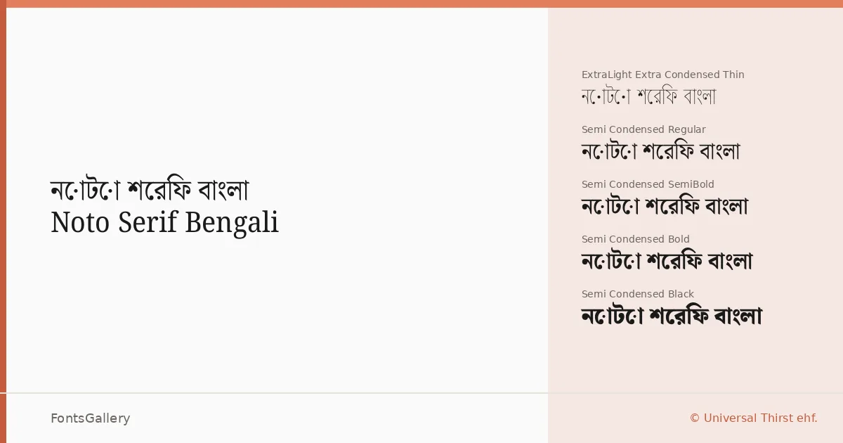
About Noto Serif Bengali Font
There is a quiet authority to the way these Bengali letterforms carry their serifs — the strokes feel considered, rooted in the script's calligraphic tradition while remaining completely functional at text sizes. The family was designed by Juan Bruce, Universal Thirst, Indian Type Foundry, and the Monotype Design Team, a collaboration that shows in how confidently the Bengali and Latin characters sit together as a unified system. The result covers both scripts without either feeling like an afterthought.
Design Aesthetics & Character Characteristics
The mood here sits at the intersection of classic structure and modern clarity — professional enough for extended reading, refined enough for display work. The family spans an unusually wide weight and width range: from Thin and ExtraLight through Light, Regular, Medium, SemiBold, Bold, ExtraBold, and all the way to Black, each available in Regular, SemiCondensed, Condensed, and ExtraCondensed widths, plus a Variable file that covers the full axis in a single TTF. That breadth means you can fine-tune typographic color across a layout without ever leaving the family.
Recommended Usage & Font Pairing
The combination of Bengali and Latin coverage makes this a strong choice for bilingual publishing — book covers, magazine spreads, website headers, and branding projects where the script needs to read with elegance at large sizes and hold up in smaller text. For pairing, the family works well alongside Helvetica or Asap when you need a clean sans counterpart, and alongside Armelie, Kactigona, or Etna when the work calls for something with more personality in display roles.
License & Usage Terms
Released under the SIL Open Font License, Version 1.1, which permits commercial use — full terms and the accompanying FAQ are available at https://openfontlicense.org. Embedding is set to installable, so documents and applications can carry the font without restriction.