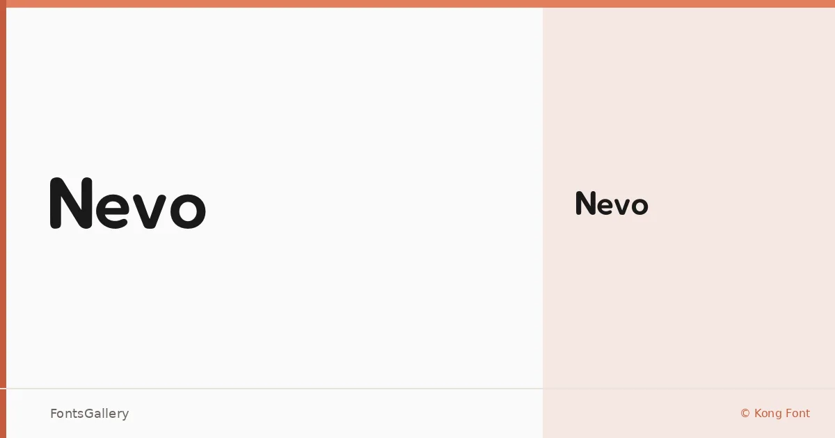
About Nevo Font
There is a clean confidence to this sans serif — the kind that comes from knowing exactly what to leave out. Kong Font released it in 2025 under a single weight, Regular, and the result is a face with minimal ornamentation and strong, deliberate geometry that holds its own at large sizes.
Design Aesthetics & Character Characteristics
The design sits squarely in modern, professional sans serif territory — bold in presence without relying on heavy strokes, and minimal in the sense that nothing decorative distracts from the letterform itself. With only one cut in the family, the Regular is engineered to carry headlines and identifiers rather than long passages of body copy. It arrives as a TTF file, ready to install, and the Latin character set keeps things focused and tight.
Recommended Usage & Font Pairing
Think branding work, logo lockups, business card typography, and website headers — contexts where a single, well-chosen weight does more than a crowded weight range. The letterforms have enough personality for identity design without overpowering a layout. For pairing, it sits well alongside faces like Canela or Armelie when you need warmth to offset its precision, and contrasts sharply against display faces like Urban Thunder Demo, AQUA, or Kactigona when a more expressive hierarchy is called for.
License & Usage Terms
Nevo is available under a Personal Use license, which does not permit commercial use — confirm licensing terms with Kong Font directly before applying it to any client or commercial project.