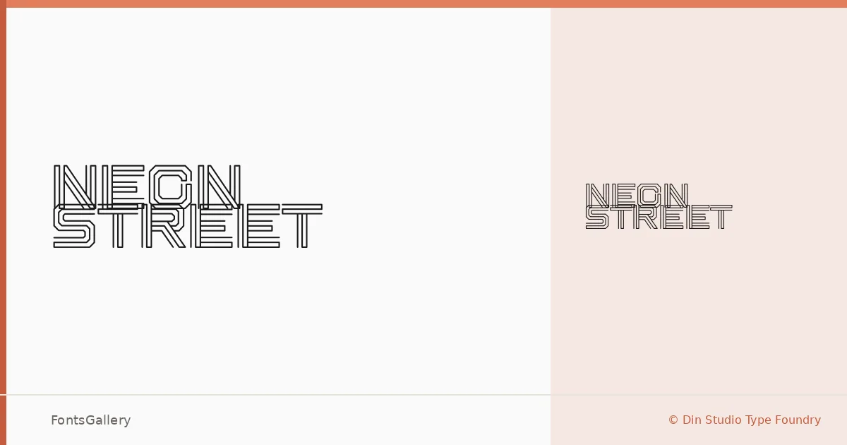
About Neon Street Font
There is a rawness to this display face — something between a spray-painted sign and a circuit board, the kind of lettering that feels like it belongs on a backlit storefront at two in the morning. It comes from Donis Miftahudin at Din Studio Type Foundry, and it arrives as a single Regular weight in OTF format.
Design Aesthetics & Character Characteristics
The character sits at the intersection of grunge and futurism — bold enough to command attention, modern enough to avoid nostalgia. That tension makes it suited to display work where the type itself needs to carry attitude: the letterforms read as deliberate and a little rough, not polished or corporate. A single cut means the design has to do all its work at once, and it does.
Recommended Usage & Font Pairing
It earns its place in branding, logo lockups, poster headlines, signage, and t-shirt graphics — anything within the Latin script range where you need a face that reads as charged and urban. As a counterpart, the neutrality of Helvetica or Asap can ground it, while Canela brings an editorial softness that plays well against the grit. Etna and AQUA share enough of a graphic sensibility to sit alongside it without competing.
License & Usage Terms
Neon Street is distributed under Personal Use terms only — confirm a commercial license at www.nathatype.com before deploying it in any paid or client-facing work. Embedding is permitted for preview and print only.