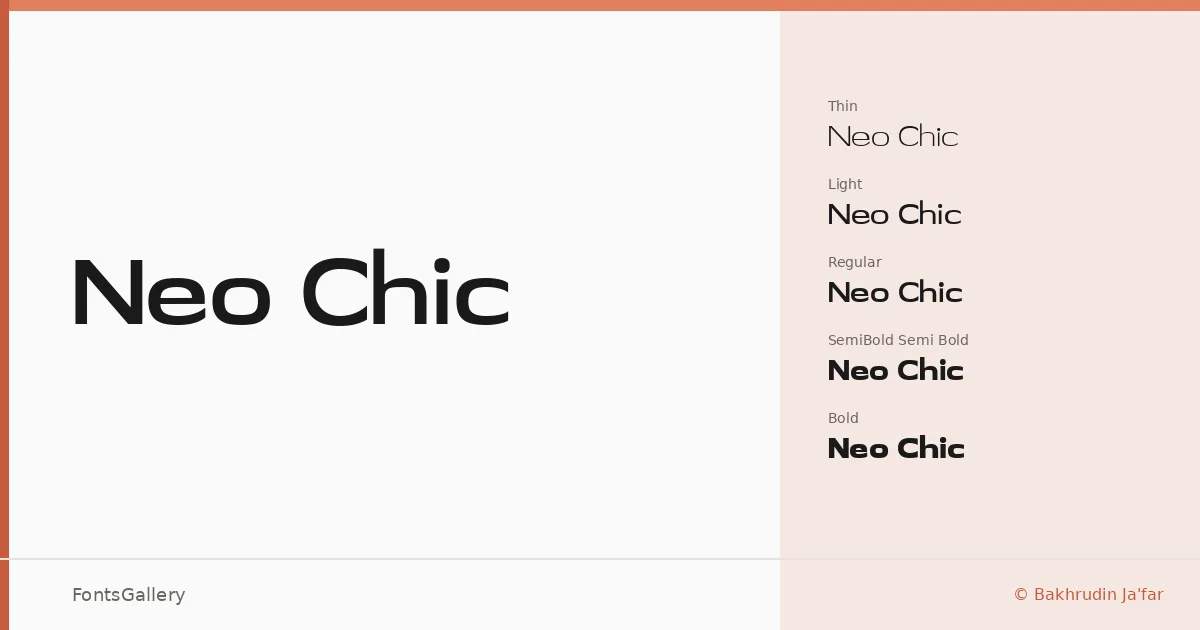
About Neo Chic Font
There is a deliberate restraint to these letterforms — the kind that comes from knowing exactly when to stop. Designed by Bakhrudin Ja'far of Roomspace Creative Lab, this sans serif moves through seven weights with consistent composure, from Thin through Bold, without ever losing its sense of quiet refinement. The geometry is clean but not cold, carrying a minimal luxury that feels considered rather than clinical.
Design Aesthetics & Character Characteristics
The family spans Thin, Extra Light, Light, Regular, Medium, Semi Bold, and Bold — a range that gives art directors real control over hierarchy and tone. Across those weights, the proportions stay narrow and upright enough to feel elegant in tight settings, while the spacing breathes enough for headlines to land with presence. Available in both TTF and OTF, the Latin character set is drawn with the kind of modern discipline that suits luxury and editorial contexts equally well.
Recommended Usage & Font Pairing
The lighter cuts work well in magazine layouts and website headers where atmosphere matters as much as legibility; the heavier weights hold up in logo work and business card design where a brand needs to project confidence at small sizes. For pairing, the family has been noted alongside Canela, Angeletta, ABC Arizona, and Armelie for editorial and brand applications, and with Minecraft where a harder contrast in character is wanted.
License & Usage Terms
This family is released under Personal Use terms — commercial use is not permitted, so confirm licensing directly with Roomspace Creative Lab before applying it to any client or commercial job. Embedding is limited to preview and print only, per the copyright held by Roomspace Creative Lab.