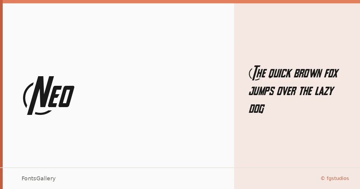
About Neo Font
There is a roughness to this display face that feels deliberate — the kind of tension between grunge and modernity that takes real editorial confidence to pull off. Released in 2024, it comes from fgstudios, and it carries that studio's instinct for type that sits comfortably at the intersection of the worn and the contemporary.
Design Aesthetics & Character Characteristics
Neo ships as a single cut — Regular — in TTF format, which keeps the proposition honest: this is a headline weight built for impact, not a workhorse family. The forms read as bold in color even where the weight might surprise you, and the vintage grain running through the design gives it the kind of lived-in character that flat, clean display faces rarely achieve. It occupies the grunge-modern space without leaning so far into distress that it becomes a period costume.
Recommended Usage & Font Pairing
The face earns its place in branding systems, poster hierarchies, logo lockups, and T-shirt graphics — anywhere a headline needs authority with a raw edge. For contrast pairings, the clean geometry of Helvetica or Bahnschrift will let the texture breathe, while the editorial warmth of Canela or ABC Arizona can soften the whole composition; Etna, sharing a similarly assertive character, works well when you want to keep the tone consistent across a layout.
License & Usage Terms
This family is distributed under Personal Use terms, which means commercial use is not covered — confirm licensing directly with fgstudios before applying it to any paid brief.