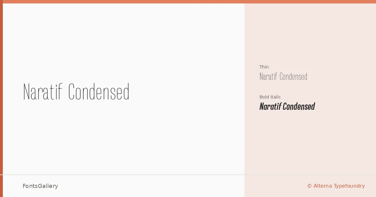
About Naratif Condensed Font
There is a particular discipline to a well-made condensed sans — every curve has to earn its place, and the spacing has to hold tension without tipping into tightness. Akufadhl, designing under the Alterna Typefoundry banner, has built exactly that kind of restraint into this family. The letterforms sit narrow and upright, carrying a quiet confidence that reads as modern and professional without shouting for attention.
Design Aesthetics & Character Characteristics
The family spans from a genuinely light Thin weight through to a Bold Italic, giving you a stark contrast in emphasis across just two cuts — Thin and Bold Italic — both delivered as OTF files. The Thin carries an elegant, almost minimal quality, where strokes feel drawn rather than constructed. The Bold Italic introduces movement and urgency to the same skeleton, making the two styles feel like natural counterparts rather than unrelated cuts. The overall mood stays clean: no humanist quirks, no decorative intrusion.
Recommended Usage & Font Pairing
The compressed proportions and Latin character set make this a natural choice for headline work, poster hierarchies, and logo lockups where horizontal economy matters. Magazine covers and branding projects that want a modern, minimal register will find both weights useful — the Thin for refined secondary lines, the Bold Italic for the lead statement. It pairs well with the serene editorial texture of Canela, the script energy of Armelie, the blunt mass of 321 Impact, the clean geometry of AQUA, and the display character of Kactigona.
License & Usage Terms
This family is available under Demo terms, which cover personal use only — confirm licensing directly with Alterna Typefoundry before committing it to any commercial job. Embedding is permitted at the editable level.