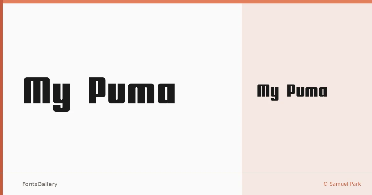
About My Puma Font
There is an angular confidence to this display face — letterforms that lean into geometry and push against convention without losing legibility. It was designed by Samuel Park, and it carries the kind of deliberate edge you expect from a designer thinking about impact first. The single Regular weight is built for moments where subtlety is beside the point.
Design Aesthetics & Character Characteristics
Landing squarely in display territory, My Puma reads as bold and futuristic, with a modern sensibility that suits large-scale settings far better than running text. The TTF file covers Latin character sets, keeping the scope focused and the execution tight. At headline sizes — the sizes where this design is meant to live — the forms assert themselves clearly and hold their shape.
Recommended Usage & Font Pairing
This is a face for branding, poster work, logo lockups, and T-shirt graphics: anywhere a headline needs to carry weight on its own. It pairs well against the rational clarity of Helvetica, the editorial softness of Canela, the structured energy of Etna, the clean geometry of AQUA, or the open friendliness of Asap — each offering a useful counterpoint to its intensity.
License & Usage Terms
My Puma is offered under Personal Use terms, which means commercial use is not permitted — confirm licensing directly with Samuel Park before deploying it in a paid or client-facing project. Embedding is restricted under the current terms.