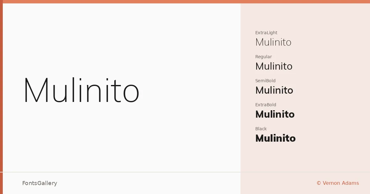
About Mulinito Font
There is a particular evenness to the stroke weight here — not timid, not aggressive, just composed. Vernon Adams built this sans serif with a clean geometric sensibility that holds its form whether it is running at caption size or blown up across a magazine spread. The letterforms are open, the apertures generous, and the overall color on the page stays remarkably consistent across all fourteen cuts.
Design Aesthetics & Character Characteristics
The family runs from ExtraLight and ExtraLight Italic through Light, Regular, SemiBold, Bold, and ExtraBold, all the way up to Black — each weight paired with a matching italic — giving you a complete, self-contained type system in a single sans serif. The mood is minimal and professional without being cold; there is just enough warmth in the curves to keep it from feeling purely mechanical. All styles are delivered as TTF files, and the range covers Latin, a partial Latin Extended set, and Vietnamese.
Recommended Usage & Font Pairing
The lighter weights are well suited to editorial work — magazine layouts, website headers, the kind of branding that relies on restraint to project confidence. The heavier cuts, ExtraBold and Black, have the presence needed for headline use and business card typography where impact matters in a small area. For pairing, the family sits comfortably alongside Canela's editorial serif warmth, or against the contrasting energy of Armelie, Urban Thunder Demo, AQUA, and Kactigona when a project calls for more expressive counterparts.
License & Usage Terms
Mulinito is available for commercial use under the SIL Open Font License, Version 1.1; full terms and a FAQ are at http://scripts.sil.org/OFL. Note that embedding is permitted for preview and print only, so confirm that restriction fits your workflow before deploying in interactive or editable documents.