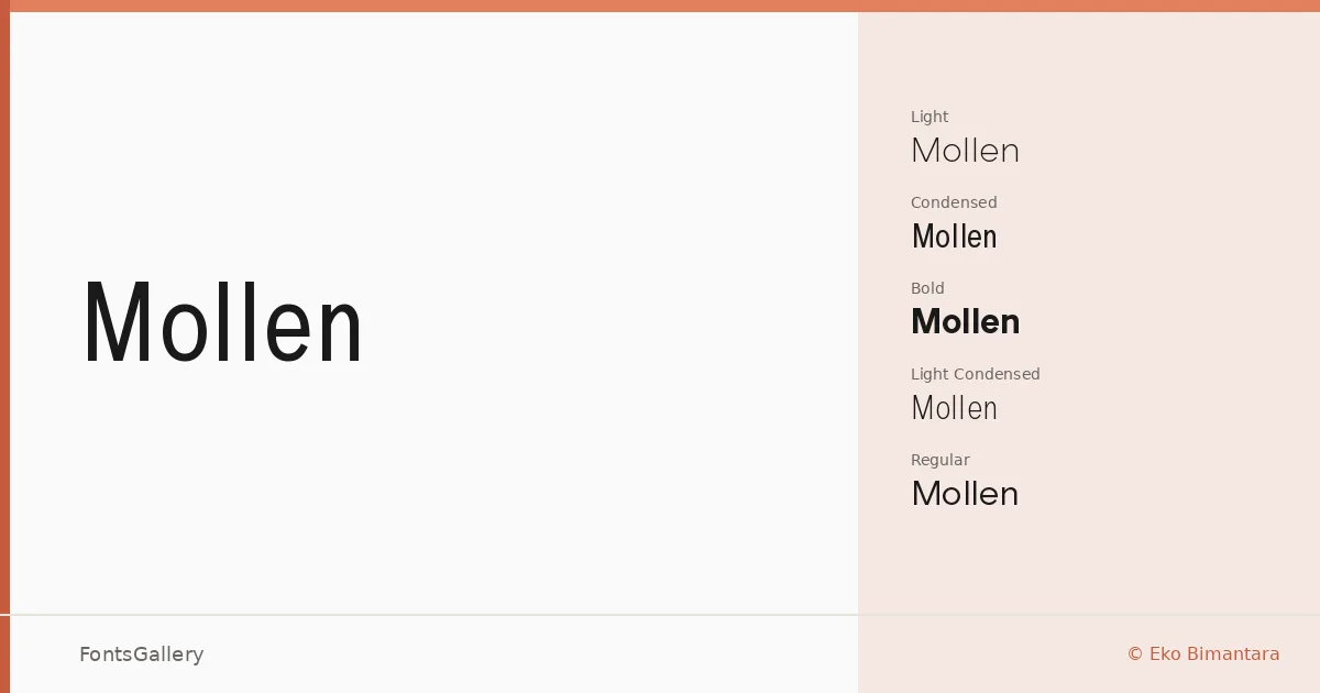
About Mollen Font
There is a quiet confidence to these letterforms — a clean geometric structure that never tips into coldness. Eko Bimantara designed this sans serif family, and the result carries a distinctly refined economy: nothing added that shouldn't be there, nothing stripped away that would be missed.
Design Aesthetics & Character Characteristics
The family spans six cuts — Light, Light Condensed, Regular, Condensed, Bold, and Bold Condensed — giving you both weight contrast and width contrast to work with. The condensed styles bring a disciplined elegance that suits tall headline formats, while the standard widths hold their composure at display sizes without sacrificing the minimal, professional character that runs through the whole set. All styles are delivered as TTF files.
Recommended Usage & Font Pairing
The narrow, elegant proportions make it a natural choice for editorial headlines, magazine covers, brand identities, and poster work where restraint reads as sophistication. Latin script is supported. For pairing, the family sits comfortably alongside Canela, Armelie, 321 Impact, AQUA, and Kactigona — each of which offers enough contrast in structure or texture to keep a layout from feeling monolithic.
License & Usage Terms
This family is distributed under a Demo license, which means it is for personal use only — confirm licensing terms with Eko Bimantara at ekobimantara.com before using it in any commercial project. Embedding is permitted for preview and print only.