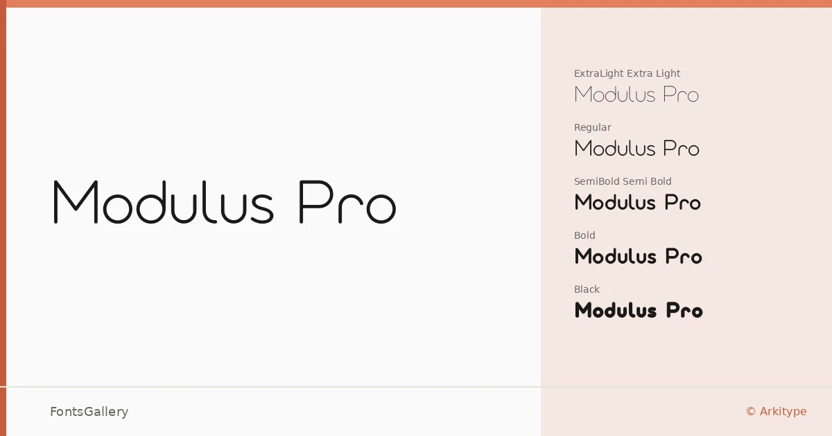
About Modulus Pro Font
There is a particular kind of quiet confidence in a well-drawn geometric sans, and Andrew Footit's work for Arkitype lands squarely in that territory. The letterforms carry clean, considered geometry without the coldness that sometimes plagues the category — proportions feel deliberate, spacing feels earned. Copyright is held by Andrew Footit, 2019.
Design Aesthetics & Character Characteristics
The family runs from Extra Light through Black — eight weights in OTF format — giving you a genuinely usable range rather than a token pair of cuts. The mood sits at the intersection of minimal and elegant: strokes are controlled, optical corrections are subtle, and nothing competes for attention unnecessarily. At lighter weights the typeface reads as refined and almost editorial; push into Semi Bold, Bold, or Extra Bold and it picks up the kind of authority that branding and logo work demands. The Black is weighty enough to anchor a cover without losing the family's underlying composure.
Recommended Usage & Font Pairing
The design is clearly built for high-visibility Latin-script settings — website headers, presentation decks, magazine layouts, and identity systems where consistent tone across a range of sizes matters. For text-heavy editorial work, pairing it alongside Canela introduces a warm serif contrast; Armelie brings a more expressive handwritten counterpoint for packaging or campaign work. 321 Impact, AQUA, and Kactigona are also listed as companions for moments when you need something with more visual tension against the family's measured geometry.
License & Usage Terms
Modulus Pro is available under Personal Use terms — commercial use is not permitted under this license, so confirm clearance with the foundry before taking it into a client or revenue-generating project. The font is licensed with installable embedding permissions.