About Metafiz Font
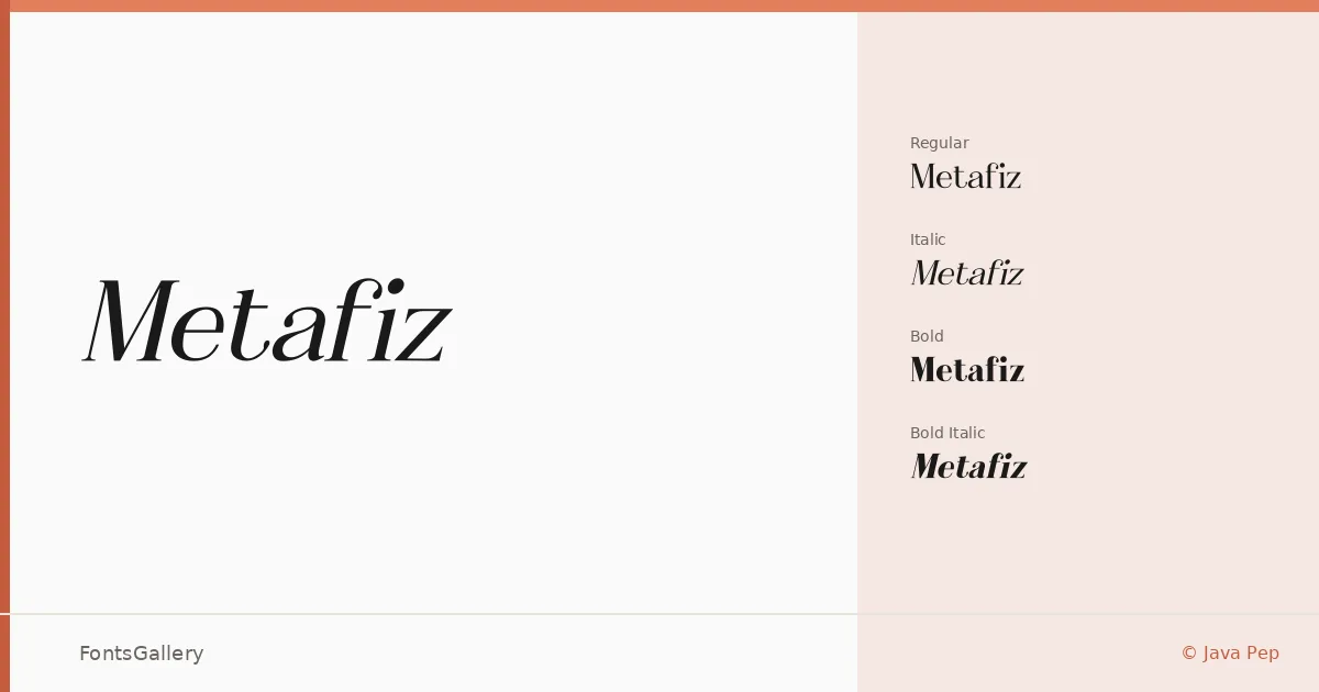
There is a quiet confidence in the serifs here — composed, unhurried, built for text that needs to carry some weight. Metafiz is the work of designer Java Pep, and it arrives in four cuts: Regular, Italic, Bold, and Bold Italic. The letterforms sit in that considered space between classical structure and contemporary restraint, with serifs that feel deliberate rather than decorative.
Design Aesthetics & Character Characteristics
This is a serif family that leans into elegance and a sense of luxury without becoming ornate. The roman cuts are steady and readable; the italics bring a gentle tilt that suits pull-quotes and secondary headings without breaking the overall tone. All four styles are delivered as TTF files, and the mood throughout reads as modern classic — the kind of type that holds its composure whether it is set large or small.
Recommended Usage & Font Pairing
The family works naturally in headline and branding contexts — book covers, magazine spreads, and logo lockups where refined character is the point. For pairing, the neutrality of Helvetica or Bahnschrift makes a clean sans counterpart, while Armelie, Etna, and Kactigona each offer different flavors of contrast depending on the project's register.
License & Usage Terms
This family is distributed under a Demo license, which covers personal use only — confirm licensing with the designer before applying it to any commercial job. Embedding is set to installable.