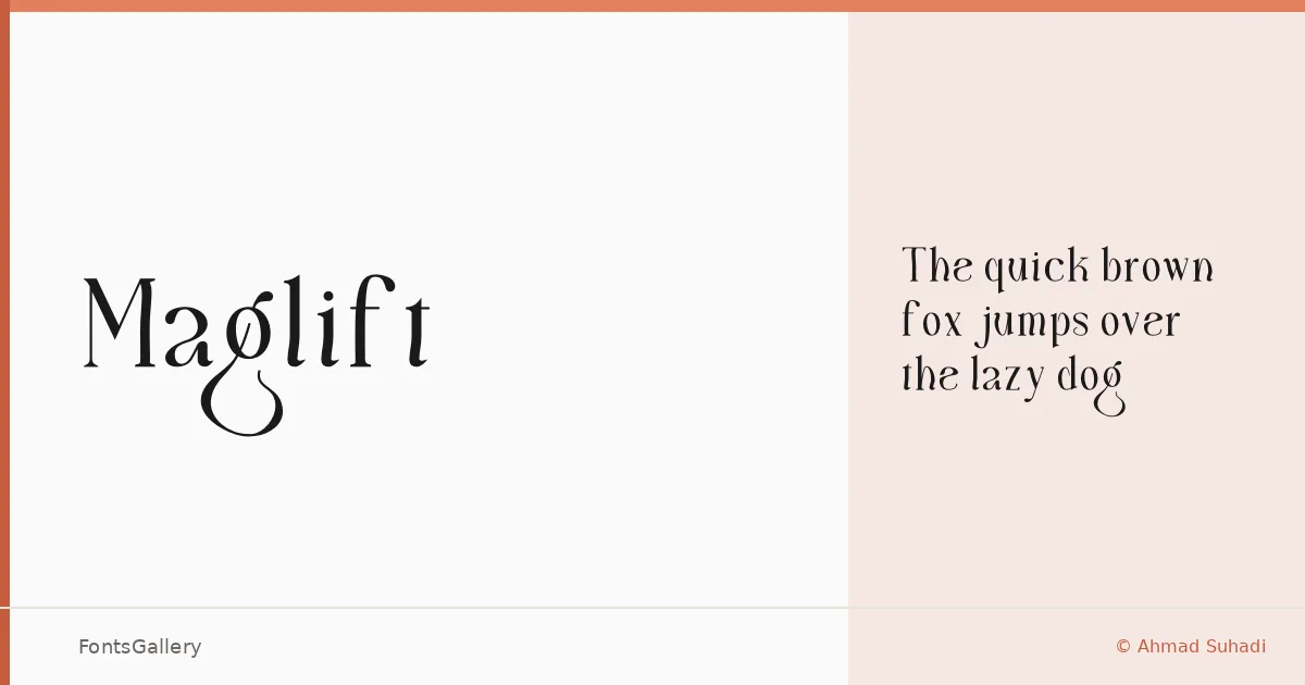
About Maglift Font
There is a deliberate composure to this serif — the kind of upright confidence that reads as authority without tipping into stiffness. Ahmad Suhadi drew it in FontCreator, and the result carries a classic editorial sensibility refined into something that feels current rather than archival. It ships as a single Regular weight in OTF format.
Design Aesthetics & Character Characteristics
The mood sits squarely in luxury and elegance territory, with letterforms that lean modern while holding onto the structured contrast you expect from a traditional serif. That combination — classical skeleton, cleaner finish — is what gives it its sense of occasion. At large sizes, where headline and logo work happen, the details in the serifs and the spacing do the most to set a tone.
Recommended Usage & Font Pairing
Book covers, magazine headlines, and branding identities are where this face earns its keep, particularly anywhere Latin-script copy needs to project polish and restraint. It pairs well with neutral sans-serifs like Helvetica and Bahnschrift for contrast-driven layouts, and sits comfortably alongside more characterful display faces such as Armelie, Etna, and Kactigona when you want two expressive voices sharing the page.
License & Usage Terms
This family is offered under Personal Use terms — the license notes state "For Personal Use Only," so confirm licensing directly with the rights holder before committing it to any commercial job.