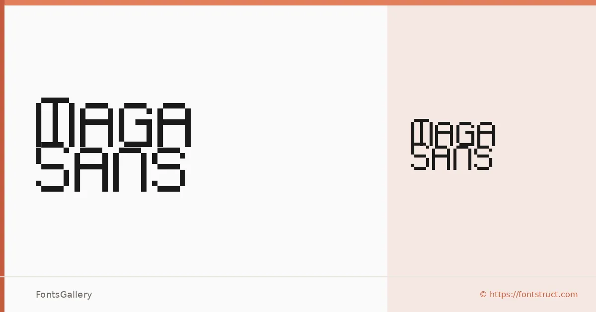
About Maga Sans Font
There is a hard-edged confidence to these letterforms — constructed geometry with just enough roughness to keep things from feeling sterile. Maga Sans was built by Antoniolugb using FontStruct, the browser-based type construction tool, and carries that modular, grid-born DNA in every glyph. The result sits somewhere between brutalist structure and grunge attitude, which is exactly where a lot of contemporary display work wants to live.
Design Aesthetics & Character Characteristics
The family ships as a single Regular weight in TTF format, so the design does its heavy lifting through character rather than a range of cuts. The mood is bold and futuristic without abandoning a modern grunge sensibility — think stencil logic crossed with street-poster energy. Latin coverage is partial, so check your character set against your copy before committing to anything multilingual.
Recommended Usage & Font Pairing
It earns its place in headline and poster work, branding systems that want an edge, logo lockups, and T-shirt design where a strong silhouette matters more than fine text performance. For pairings, the listed companions span a wide range of registers: Etna and AQUA share a similar display ambition, while Canela brings organic warmth, Helvetica offers clean neutrality, and Bahnschrift adds industrial precision — any of those can anchor body copy or secondary type alongside this face.
License & Usage Terms
Released under the Open Font License, which allows commercial use — you can proceed confidently on client work. Embedding is permitted for preview and print purposes only, so factor that in for interactive or installable document workflows.