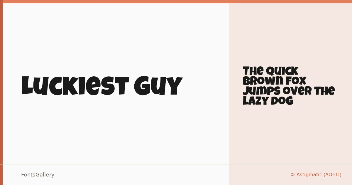
About Luckiest Guy Font
There is something immediately recognizable about those thick, inline letterforms — chunky, upright, and packed with the kind of confident bounce you find in vintage American advertising and carnival signage. Luckiest Guy is a display typeface from Brian J. Bonislawsky of Astigmatic (AOETI), built around a single Regular weight and delivered as a TTF. The characters carry a retro exuberance, each glyph pushed to the edges of its bounding box in a way that feels deliberate and physical rather than casually constructed.
Design Aesthetics & Character Characteristics
The mood sits squarely in bold and playful territory, with a whimsy that never tips into cuteness — there is real weight behind these letters. As a single-style display family, it is built for situations where the type itself is the primary visual event: headlines, posters, and logotypes where subtlety would be a mistake. The Latin character set is tightly drawn, and the letterforms hold up well at large sizes, where every thick stroke and compressed proportion reads exactly as intended.
Recommended Usage & Font Pairing
This face belongs wherever a headline needs presence and personality — children's book covers, poster campaigns, T-shirt graphics, and logo treatments all play to its strengths. Because it is so characterful on its own, it pairs best with something neutral or refined to carry body copy: Helvetica or Asap offer clean contrast, while Canela, Etna, or ABC Arizona bring their own editorial weight without competing for attention.
License & Usage Terms
Released under the Apache License 2.0, which permits commercial use, and the embedding permission is set to installable, so you can deploy it across documents and applications without restriction.