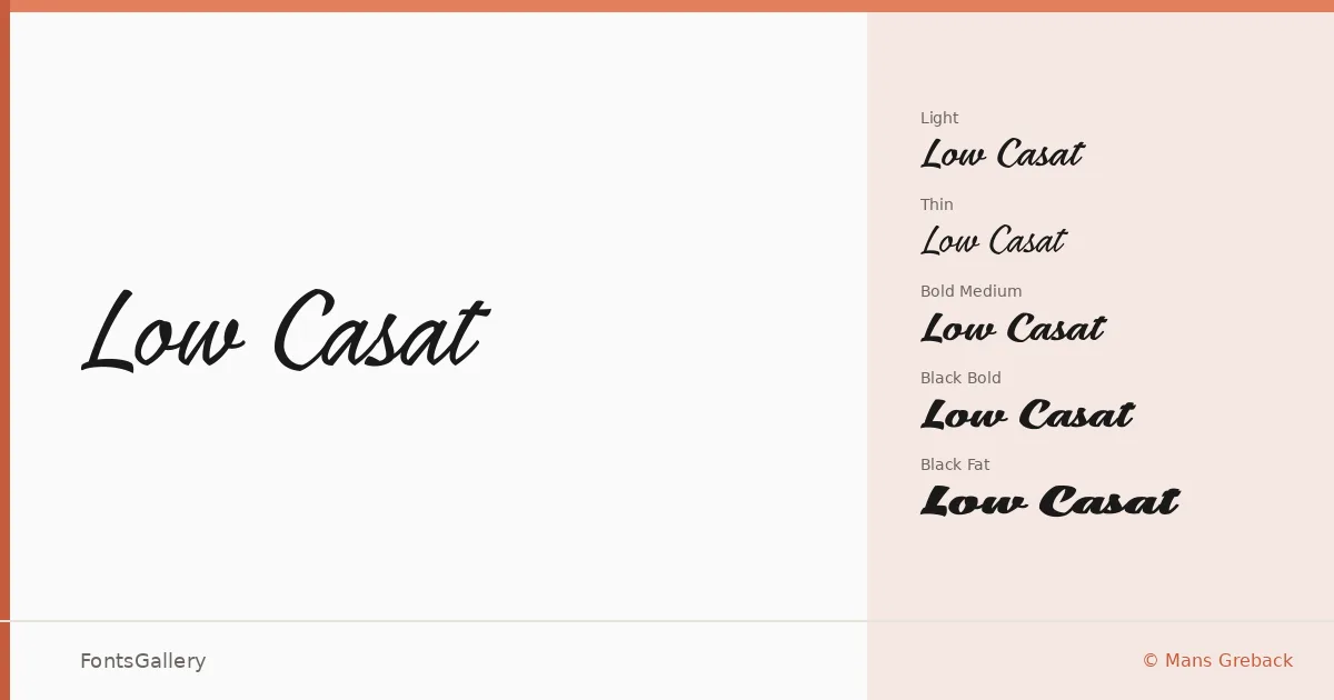
About Low Casat Font
There is a particular quality to the stroke contrast here — the way the thins pull back almost to nothing while the swells push forward with quiet confidence. This is a script from Mans Greback, and it carries the kind of considered rhythm you find in calligraphy that has been drawn and redrawn until only the essential tension remains. The letterforms lean into elegance without tipping into excess.
Design Aesthetics & Character Characteristics
The family spans five cuts: Low Casat Light and Thin at the delicate end, Medium sitting in the workhorse middle, and Bold and Fat delivering real weight for display applications. That range means the same romantic, classic sensibility scales from whisper-thin headline work all the way to heavy logotype use. The forms throughout feel rooted in luxury — the kind of script that reads equally well on cream card stock and against a dark background on social media. Files are delivered in TTF format, covering Latin character sets.
Recommended Usage & Font Pairing
The natural territory here is branding, wedding stationery, invitation cards, and logo work where a sense of occasion matters. The thinner weights are particularly well suited to editorial pulls and social media graphics where air around the letterforms is an asset. For pairings, it sits well alongside Canela, Helvetica, ABC Arizona, Etna, and Adobe Caslon Pro — the contrast between this script's calligraphic warmth and a composed serif or clean sans tends to resolve very cleanly.
License & Usage Terms
This family is available under Personal Use terms only — confirm you have the appropriate commercial license from www.mansgreback.com before taking it into any client or revenue-generating work. Embedding is permitted for preview and print only.