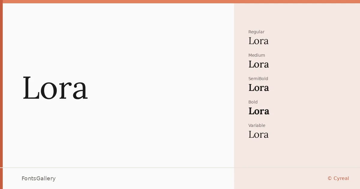
About Lora Font
There is a particular quality to these serifs — calligraphic in origin, grounded in the tension between a pen held at an angle and the demand for contemporary clarity. Olga Karpushina designed the Latin, and Alexei Vanyashin of Cyreal handled the Cyrillic, which means the script support feels considered rather than bolted on. The result is a literary face with genuine warmth in its curves and just enough contrast in its strokes to hold attention across long passages of text.
Design Aesthetics & Character Characteristics
The family carries a classic, professional elegance without tipping into stiffness. It comes in five upright weights — Regular, Medium, SemiBold, Bold, and the continuous range covered by the Variable — each paired with a corresponding italic, plus Variable Italic for fine-grained control in between. All cuts are delivered as TTFs. The italics are particularly expressive: the letterforms lean with purpose, keeping their calligraphic heritage visible without sacrificing the modern crispness expected in editorial and branding contexts.
Recommended Usage & Font Pairing
This is a face that earns its place in book covers, magazine layouts, and website headers — anywhere the text needs to feel authoritative but approachable. The Latin, Vietnamese, and Cyrillic coverage means it can serve multilingual publications without switching faces mid-project. For pairing, the clean geometry of Helvetica or Bahnschrift gives a sharp counterpoint to its warmth, while the character-driven personality of Armelie, Etna, or Kactigona creates more expressive combinations for branding and display work.
License & Usage Terms
Released under the SIL Open Font License (OFL), Version 1.1, which allows commercial use freely — full terms and FAQ are at https://scripts.sil.org/OFL. Embedding is set to installable, so you can distribute documents with the font embedded without restriction.