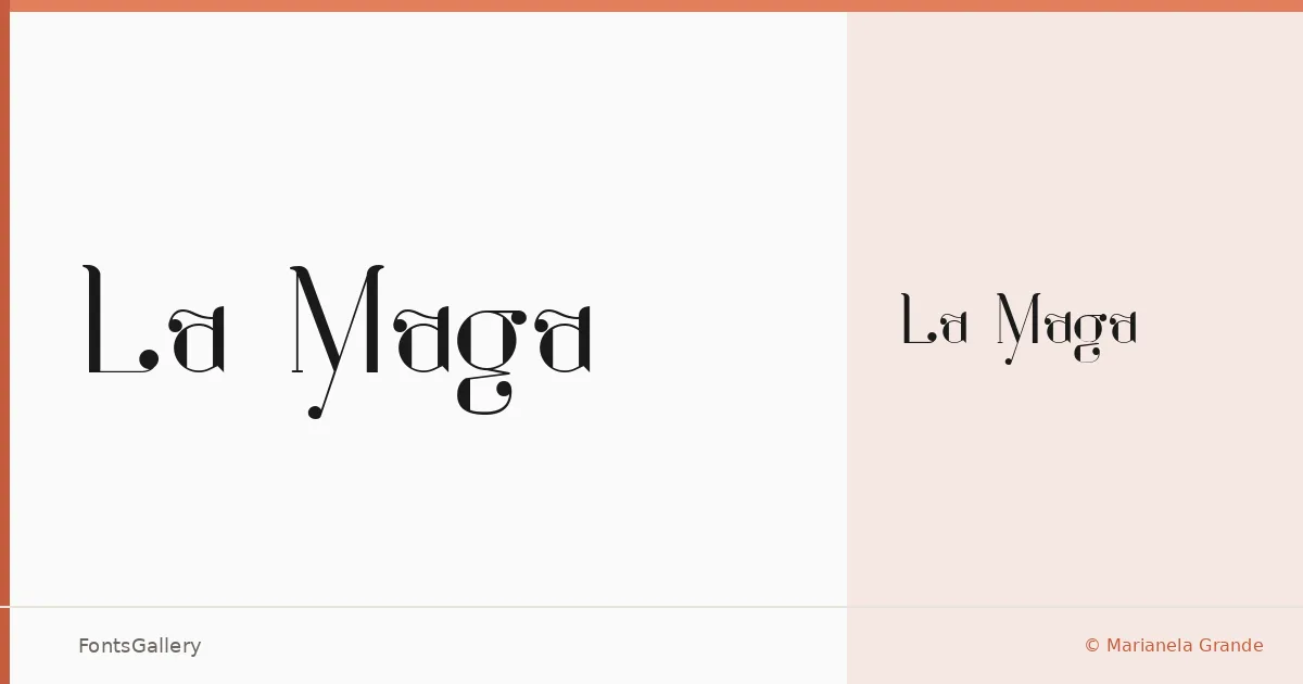
About La Maga Font
There is a particular quality in the way this script moves — unhurried, with the kind of deliberate flourish that belongs to ink on paper rather than pixels on a grid. La Maga is a single-weight display script designed by Marianela Grande, and its letterforms carry a distinctly romantic, vintage sensibility shaped by the calligraphic tradition.
Design Aesthetics & Character Characteristics
The Regular weight arrives as a TTF file and sits squarely in the display category, which means it was drawn to be seen large rather than read small. The mood is luxury and elegance without hardness — curves that feel hand-guided, with the kind of rhythmic variation in stroke weight that gives a script its life. Partial Latin coverage supports the core Western European character set.
Recommended Usage & Font Pairing
It reads naturally in wedding stationery, editorial mastheads, poster headlines, and branding contexts where a romantic or vintage tone carries the message. For logo work and magazine layouts, pairing it with a clean geometric or transitional face creates the contrast that lets it breathe — Helvetica or Bahnschrift provide cool neutrality, while Canela brings a warm editorial softness, Etna adds structural contrast, and AQUA offers a lighter counterpoint.
License & Usage Terms
La Maga is available for commercial use. Note that embedding is permitted for preview and print only, so confirm those constraints suit your production workflow before embedding in interactive or web-delivered documents.