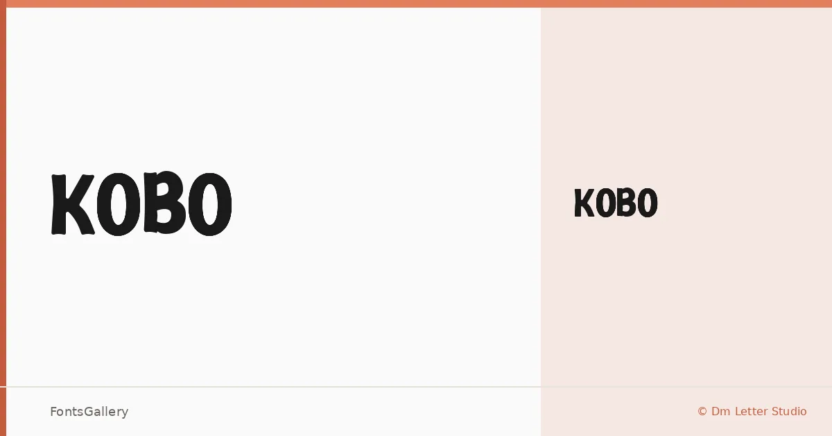
About KOBO Font
There is a confident stillness to this sans serif — strokes that commit fully to their weight without borrowing from either geometric minimalism or humanist warmth. It comes from Dimas Prasetyo at Dm Letter Studio and is available as a single Regular cut in TTF format.
Design Aesthetics & Character Characteristics
The design sits squarely in modern, professional territory — the kind of bold, clean Latin letterforms that hold their shape at large sizes without feeling overcrowded. A single Regular weight means you are working with one well-resolved voice rather than a range, so decisions about hierarchy fall to scale and spacing rather than to weight contrast. The forms feel direct and authoritative, built for impact rather than extended reading.
Recommended Usage & Font Pairing
It earns its place in branding, logo lockups, poster headlines, and T-shirt design — situations where Latin coverage is sufficient and a strong, unambiguous mark matters. When you need to build out a layout around it, the listed companion faces — Canela, Armelie, 321 Impact, AQUA, and Kactigona — each offer a different kind of contrast, from editorial serif to expressive display.
License & Usage Terms
This family is released under Personal / Demo Use License terms, which means commercial use is not permitted and embedding is restricted — confirm licensing with Dm Letter Studio before committing it to any commercial job.