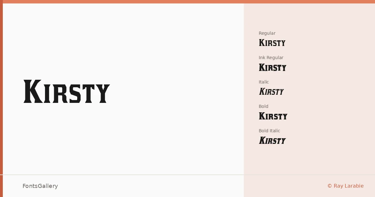
About Kirsty Font
There is a confident slab-serif warmth to these letterforms — sturdy serifs anchoring headlines without tipping into the cold rigidity that plagues lesser display faces. Ray Larabie drew the family and dedicated it to the late Kirsty MacColl, and something of that tribute lingers in the care of the curves. Available as TTF files, it covers Latin script throughout.
Design Aesthetics & Character Characteristics
The family sits squarely in the slab-serif tradition, carrying a vintage and classic sensibility that reads as professional rather than nostalgic. Five cuts are included: Regular, Italic, Bold, Bold Italic, and the textured Ink Regular variant, which introduces a slightly worn quality suited to work that needs a human edge. The Bold weight commands attention without shouting, and the Italic styles add enough movement to keep editorial layouts breathing.
Recommended Usage & Font Pairing
This is a face built for headline work — posters, magazine folios, logo lockups, and branding projects where a strong typographic voice is needed from the first glance. For pairing, it works well alongside neutral sans-serifs like Helvetica and Asap, or gains personality when set with more characterful faces such as Armelie, Kactigona, or Etna.
License & Usage Terms
This family is released under a Personal Use license, which means commercial use is not permitted — confirm licensing terms directly with Ray Larabie at larabiefonts.com before committing it to a client job. Embedding is permitted at the installable level.