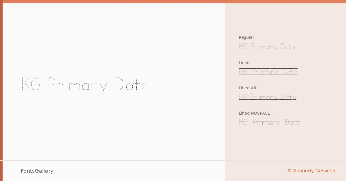
About KG Primary Dots Font
There is something immediately recognizable about letterforms built from dotted strokes — the eye follows each character the way a child's pencil would, tracing the shape before committing it to paper. This handwritten family was designed by Kimberly Geswein, whose work consistently draws from classroom and childhood vernacular. The dotted construction gives every glyph a light, unfinished quality that feels intentional rather than rough.
Design Aesthetics & Character Characteristics
The family arrives in four TTF cuts: Regular, Regular Lined, Regular Lined Alt, and Regular Lined NOSPACE — a suite that covers both free-floating letterforms and versions with baseline guides built directly into the glyphs, which is a practical detail for educational layouts. The mood is playful and whimsical throughout, with the lined variants adding structure without losing the handmade warmth. Latin character coverage keeps the scope focused, and the dotted stroke treatment makes even a single headline feel approachable and friendly.
Recommended Usage & Font Pairing
The lined cuts are a natural fit for children's book interiors, activity sheets, or any invitation card where you want to evoke handwriting practice without using an actual ruled page. The standard Regular works well across greeting cards and social media graphics where the dotted texture reads clearly at display sizes. It pairs well with the clean rationalism of Helvetica or the editorial warmth of Canela, and also sits comfortably alongside Etna, AQUA, and ABC Arizona when the project calls for contrast between structured and expressive type.
License & Usage Terms
This family is offered under Personal Use terms — commercial use is not permitted under the current license, so confirm the appropriate license at kimberlygeswein.com before applying it to any paid work. Embedding is set to installable.