About Karate Font
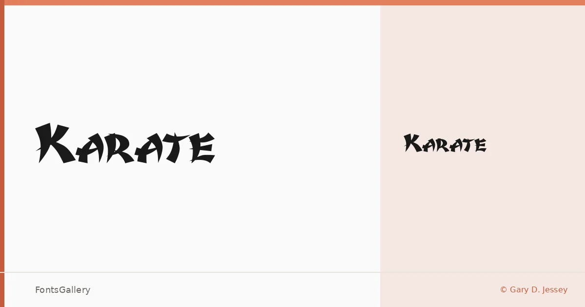
There is a rawness to these letterforms — edges that feel hand-hewn, surfaces that carry the texture of something printed on rough stock or pressed into aged material. Gary D. Jessey designed this single-weight display face, available as a TTF, with a grunge sensibility that reads as worn and deliberate rather than accidental.
Design Aesthetics & Character Characteristics
The family ships as one cut — Karate Medium — which keeps things simple and focused. It sits firmly in the display category, carrying a rustic, vintage weight that gives headlines immediate presence without needing extra styles to make an impression. The forms lean bold and unpolished in the best sense: think weathered signage, old woodblock type, or a stamp that has seen use.
Recommended Usage & Font Pairing
It earns its place in branding projects, poster work, logo lockups, and T-shirt design — anywhere a headline needs grit and character rather than precision. The texture it introduces pairs well with cleaner, more neutral companions; Helvetica or Bahnschrift can ground it in a layout, while Canela or Etna offer softer contrast, and AQUA brings its own display energy to a more expressive composition.
License & Usage Terms
This family is available for commercial use, and the embedding permission is set to installable, so you can deploy it across documents and applications without restriction.